 This blog post is by Mark Díaz, the Smart Chicago Collaborative’s graduate fellow from Northwestern University’s Technology & Social Behavior PhD program. Mark is assisting with Smart Chicago’s collaborative data work, supporting efforts in data-driven journalism and advocacy.
Many tools aim to synthesize large amounts of data into engaging and digestible forms. Flashy infographics and interactive data tools can be found in advertisements, in news, and in educational settings. They bring to life static visualizations by letting users manipulate what they see— from zoomable geographic maps showing detailed landscapes and terrain to bubble charts summarizing data breaches, users can discover more information and rich stories in a single, interactive data tool.
Introducing interactive elements to a data tool, however, risks potential information overload. With more data to digest, highlighting the most important components and allowing the user to step through information at a comfortable pace becomes a challenge. Because interactive visualizations can take many forms, there is no single way to design an elegant user experience. One way to counteract information overload is to construct a narrative within an interactive data tool. These engaging tools are designed for specific users and designed for those users to leave with specific takeaways in mind.
Given my background in design and my emerging interest in civic tech and data engagement, I wanted to highlight a crop of tools that I think offer engaging experiences driven by both interactivity and narrative flow.
Tools that check our assumptions
The New York Times regularly puts out interesting charts and infographics on a variety of topics. In particular, their You Draw It series features interactive graphs depicting various trends, including the effect of Obama’s domestic policies and the relationship between family income and children’s college prospects.
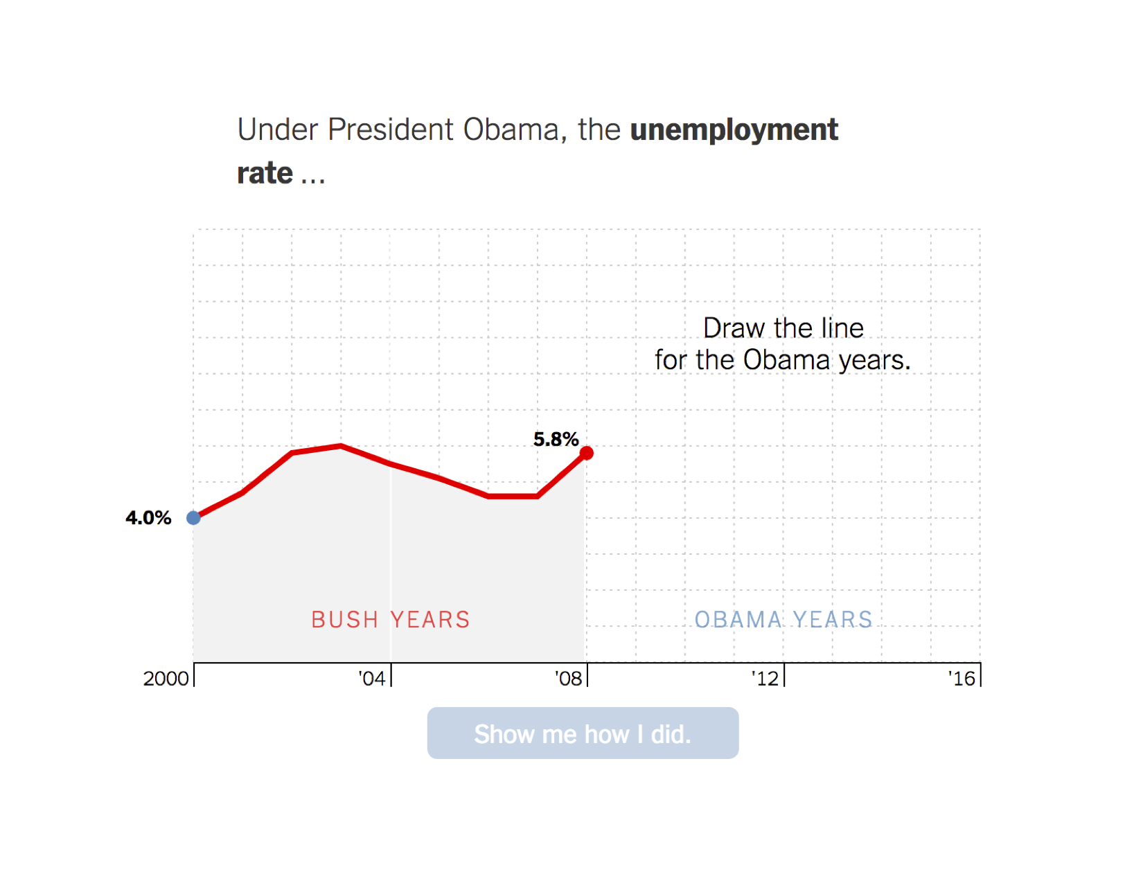
What sets these interactive data tools apart from others is the fact that the user has to complete unfinished graphs with their own guess before they can see the real data. The tools do a great job of forcing the user to take a few seconds to think about their perception of the world and, in doing so, check their understanding. The graphs then present the real data in comparison with user’s guesses.
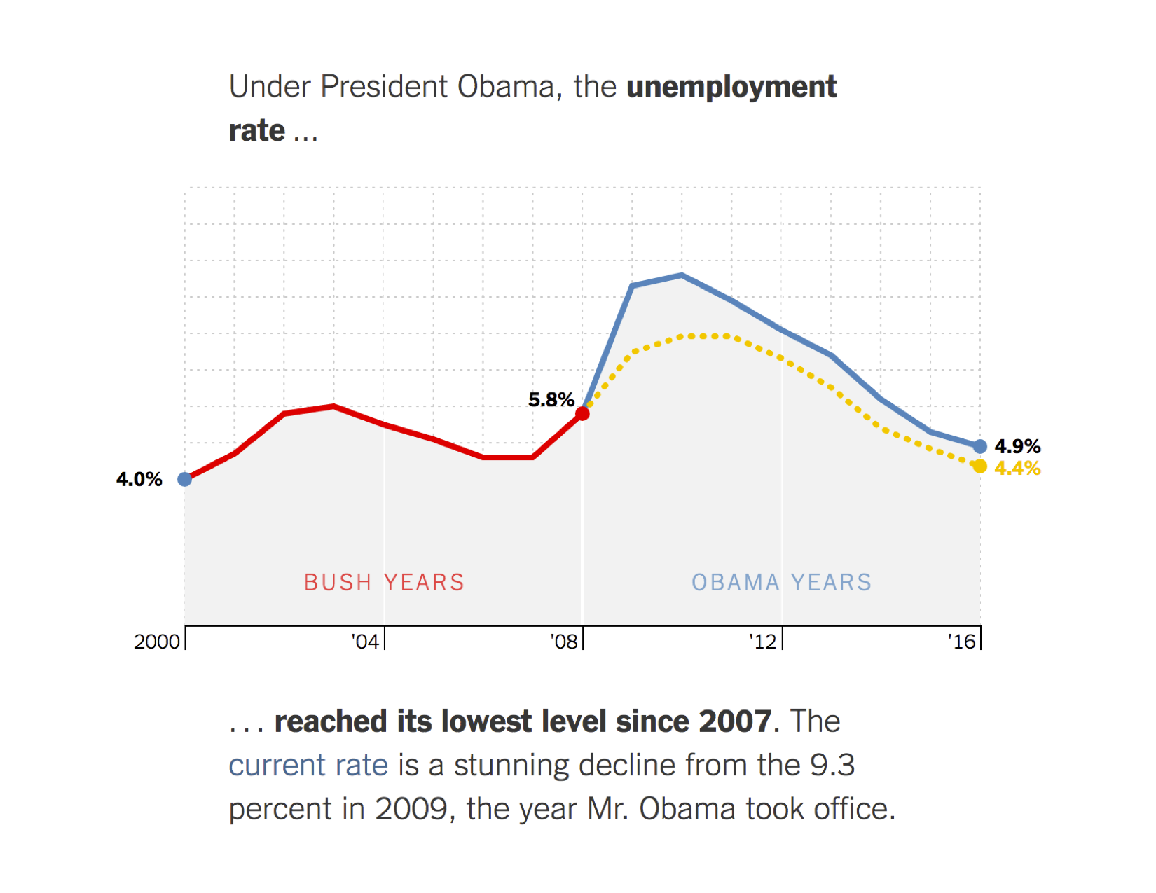
Some of the You Draw It graphs will even tell you how your guesses compared to other people’s guesses. It might be tempting to give the facts of an often misunderstood story upfront, but hooking users by leveraging their own perspective can help them think carefully about the data they are seeing.
Tools that address the “so what?”
A lot of data tools and visualizations out there are interesting and fun because of unexpected or funny data. Maps showing regional slang terms or the richest person in each state can offer some fun surprises, but, not all data will seem equally personal or relevant to all people. More importantly, sometimes it can be difficult to connect the data in a visualization to what it means for an individual and their community. The Use of Force Project features extensive information about use of force policies in different police departments along with a 12-page report on the relationship between these policies and police violence. Before getting to the data tool, the site presents the user with a thesis statement and concise bullet points framing why use of force policies deserve attention.
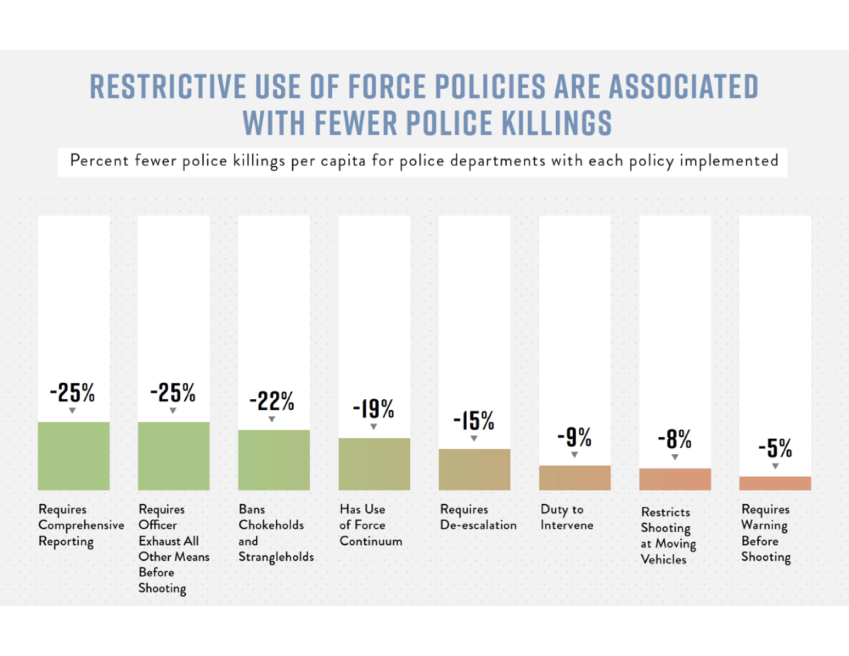
The website has a plethora of information, yet it’s easy to walk away with the main idea and argument. Online, the most valuable currency is attention and a compelling “so what” can hold attention a little longer.
Tools that address the “what now?”
Our States is a nifty site created by StayWoke, a nonprofit dedicated to supporting data, design, and policy-related projects pursuing equity and justice. The OurStates website leads with a mission of challenging policies endorsed by the Drumpf administration. When first landing on the page, the user is met with why the tool exists and is presented with an expansive interactive map. The map is rich with information about policies both in harmony with and opposed to President Drumpf’s political platform.
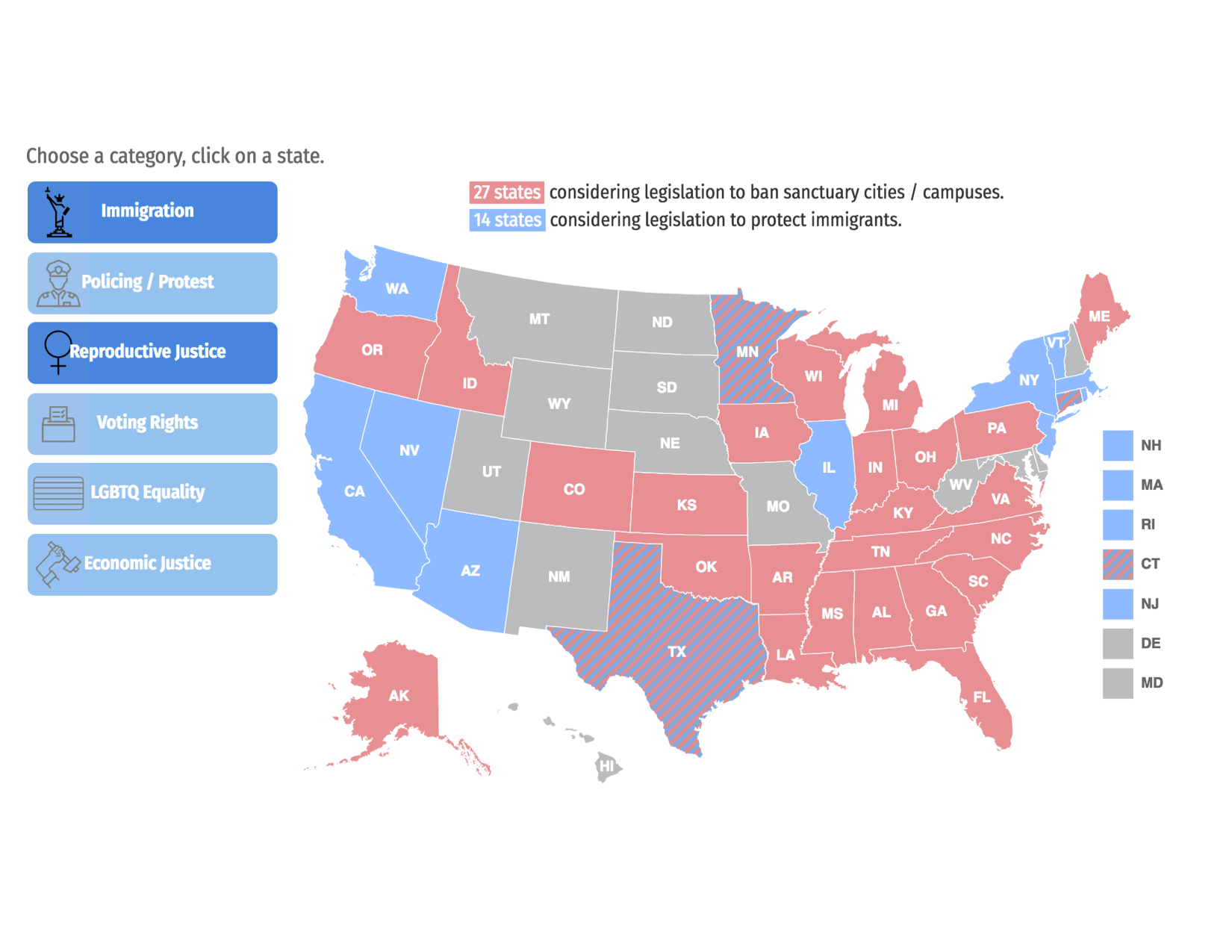
The tool foregrounds civic engagement and gives information on specific action that users can take to support or challenge legislation. The tool gives an overview of legislation across the country while simultaneously allowing users to home in on their own state. A downloadable guide sits just below the map and complements newly learned political knowledge with political action. The site makes it straightforward for the curious user to take next steps toward channeling energy into civic response.
The tool foregrounds civic engagement and gives information on specific action that users can take to support or challenge legislation. The tool gives an overview of legislation across the country while simultaneously allowing users to home in on their own state. A downloadable guide sits just below the map and complements newly learned political knowledge with political action. The site makes it straightforward for the curious user to take next steps toward channeling energy into civic response.
Designing with a narrative in mind
Ultimately, each of the data tools above communicates clearly to the user. These aren’t just standalone tools. They are imbued with different perspectives and, just as an essay helps you think through arguments and ideas, so do compelling data tools. Rather than simply display new information to the user, they compel the user to learn, reflect, and sometimes act. When thinking about advocacy and civic engagement, strategic design starts with a few simple questions: Who do I want to use this? Why do I want them to use this? What do I want to happen when they use this? What do I want to happen after they use this? Great data tools will, in one way or another, supply users with the answers to these questions. Data tools offer an informal space for civically engaging users and helping them become better social critics.


