CUTGroup #15 – Chicago Public Schools (CPS.edu) Website

Mobile View of CPS.edu
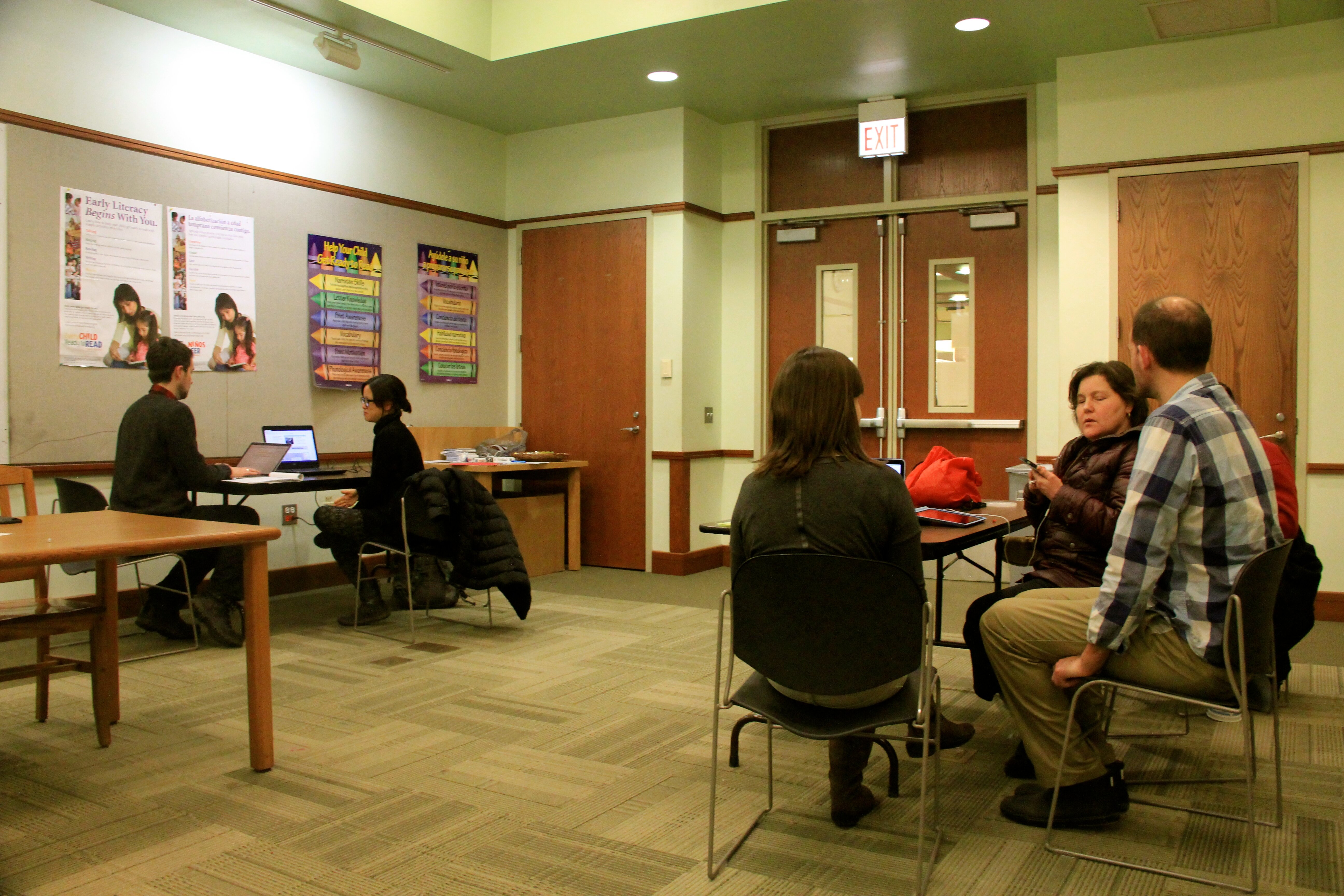
For our fifteenth Civic User Testing Group session, we tested the Chicago Public Schools (CPS) website. This in-person test took place at one of the Connect Chicago locations – Chicago Public Library Roosevelt branch at 1101 W. Taylor Street.

Here is what the CPS website team said about why they wanted to do a CUTGroup test:

“We recently redesigned our website to be parent focused and mobile device friendly. We improved our search results, tagged content by topic and age level and created a district calendar. We are curious to know if the new design is meeting the needs of our parents.”

Ted Canji, Jay Van Patten, and Matt Riel, who redesigned the CPS website were interested in testing these things:

  • Find School Information: Can parents find a school easily? Do they use the School Locator? Do they use the search feature? Are parents comfortable using search?
  • Website usability: We wanted to discover if there are areas of the website that are challenging to use.
  • Mobile devices: We wanted to learn about how easy it is to visit the CPS website on a mobile device. We also wanted to know if parents have visited the CPS website before and learn more about how they get information about schools.

Segmenting

On March 25, we sent out an email to all of our 868 CUTGroup participants. We wanted to know if they would be available for an in-person test on April 1 for about 30-45 minutes. We asked some screening questions to gather information. When choosing testers the main priority was to get parents of CPS students who had children in different grades. In addition, we wanted testers who had different types of mobile devices and some who have lived in Chicago for a long time, as well as parents who were newer to Chicago or their neighborhood.

We ended up having 10 testers participate in this test. 8 of these testers were from our CUTGroup community, but one tester brought in two friends who drove her to the test, and since they qualified as CPS parents, we allowed them to test. They also signed up to be part of the CUTGroup.

Screening Questions

We heard from 35 CUTGroup members during our callout for testers. Here is what we learned from our screening questions:

  • 74% of CUTGroup respondents have children who go to Chicago Public Schools
  • 68% of CUTGroup respondents have lived in Chicago for over 20 years

Test Format

For this test, each tester was paired up with a proctor. They were asked to bring their mobile device, and the proctor asked questions about the CPS website and then captured those responses. We not only wanted testers to review the website and do tasks to see how easy the site was to use, but we also wanted to understand how testers normally got information about their child’s school. We were curious if they have ever used the CPS website before or went online to search for information about different schools.

Results

Finding School Information

Past experiences

When we asked testers whether or not they ever searched online for information about the schools that their children attend, overwhelmingly (7 out of 10) testers said “No.”

Parent of Three Girls (#9) says, “I have looked before when she was first starting for information about the school. I’ve heard a lot of stuff about the school, but I like her teachers, and I go off of that.”

When asked whether or not they have ever visited the CPS website, 7 out of 10 testers said “Yes.” This is how these testers used the CPS website in the past:

  • 3 testers used it to choose a new school or High School
  • 2 testers used it to check the calendar of events
  • 1 tester wanted to learn more about Local School Councils, and
  • 1 tester wanted to find out about after-school programs

We asked testers how easy it is to find information about schools, whether online or in person. Half of the testers answered right in the middle about how difficult or easy it was to find school information:

5 Very Easy                  20% (2)
4 Easy                          10% (1)
3 Neutral                   50% (5)
2 Difficult                     20% (2)
1 Very Difficult             0%

We learned that a lot of our testers find out what is happening in their children’s schools from communication with the teachers either via phone, parent/teacher conferences, notes, email. Testers also learn about about what is happening in their school from other parents, weekly email newsletters and communications with teachers.

During the test

When searching for their child’s school, 6 out of 10 testers used the School Locator, but all testers thought it was an easy time searching. Testers were then asked to tell us the most important and least important information on the school’s profile pages. The most important information testers called out included: address/contact information, progress reports, number of students, test scores, admission and graduation rates. When asked about the least important information, 4 testers said that all of the information was important to them.

When all testers were asked to use the School Locator tool and search for an address, we saw that about half of the testers had some degree of difficulty using this feature. 4 testers had trouble with viewing the map and filters when holding their phones vertically; 2 of these testers were testing with their iPhones, while the other 2 were on Android devices. When holding their phone vertically, testers only saw the list of school names, but when clicking on the name it would open more information on the map which was not on view for the tester. The tester would have to hold their phone horizontally in order to see both the map and the list.

Usability of CPS.edu

We were very interested in learning more about how parents searched when finding information from their school or about other topics. The CPS website team wanted to see if parents were comfortable using the search features. Therefore, we asked testers to search for information that they were interested in learning more about. Half of the testers clicked on the appropriate topics to find out more information, while the other half of the testers used the search box. Only three testers had trouble finding the information they were looking for.

When testers were asked to search for their child’s school (in any way that they wanted), 6 out of 10 of the testers used the School Locator. All testers thought it was an easy experience to find their child’s school.

Active in the schools (#1) said, “It didn’t take but a hot second, I typed in Lane and it popped right up.”

A few testers experienced slow load times for the next pages. For example, Meekmeek (#10) downloaded a PDF of the calendar because the calendar did not show up on her screen, but the PDF was difficult to read since she had to zoom in and out. When clicking on “Calendar” it showed a white screen, and took a very long time to load.

A few testers reached PDFs during their tests and either they were not as easy to use such as in Meekmeek’s(#10) case, or they did not load. Parent of Three Girls (#9) chose a PARCC article in the headlines. When clicking on it, she was asked to download a PDF. After downloading, she clicks to open it but gets an error message saying that she cannot open the file.

As mentioned above, during this test we learned the biggest improvement that could be made was the School Locator and changing the view from a horizontal layout to a vertical layout. In general, all testers said they liked the CPS website and most of them had an easy time using the website.

“I just think the website is better than it used to be!” – High School Parent (#5)

“It is very easy to use. I like that they give you the address, phone, type, classification, programs offered… I like that they tell you a lot.” –Parent of k (#8)

Mobile devices

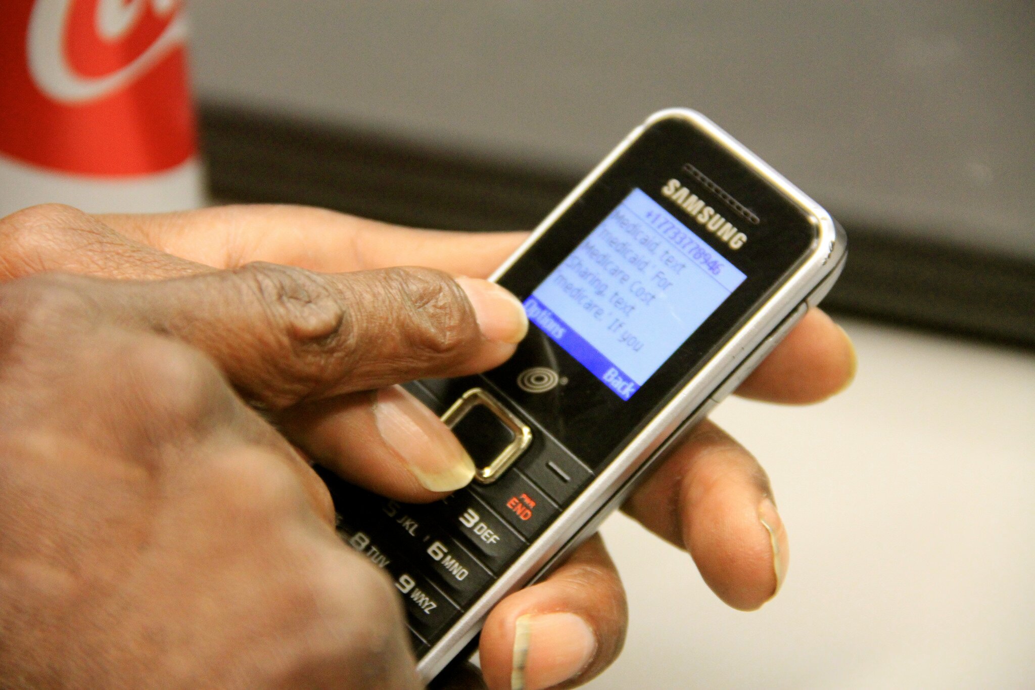
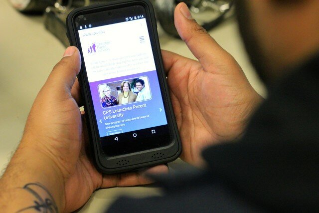
Normally for CUTGroup tests, we encourage testers to bring their own phones and devices for testing. It is important that we not only test mobile-friendly websites, but that we test them on their own devices. We not only learn about usability issues on different types of phones, but we also better understand how testers navigate tasks on their own device. 5 testers tested on laptops that we provided, and here is a look at the devices the other 5 testers used:

  • iPhone 5
  • iPhone 6
  • Nexus 5
  • Boost ZTE Max
  • Android HTC Desire 10 Boost Mobile

Besides some of the issues we outlined above, most testers using a mobile device had an easy time navigating the new CPS website. We were excited to test a website that not only reaches so many parents in the city of Chicago, but are also excited as the CPS website team continues to redesign with mobile devices in mind. This CUTGroup opportunity was a great example of getting feedback directly from residents (and parents), on their own devices, while better understanding their own experiences when finding school information.

Changes to CPS.edu

Since this CUTGroup test, the CPS website design team has made enormous changes to the School Locator tool including instructional pop-overs to encourage parents to start their search, get more information, and provide details about the map legend and the tools available.

New CPS.edu School Locator Screenshot

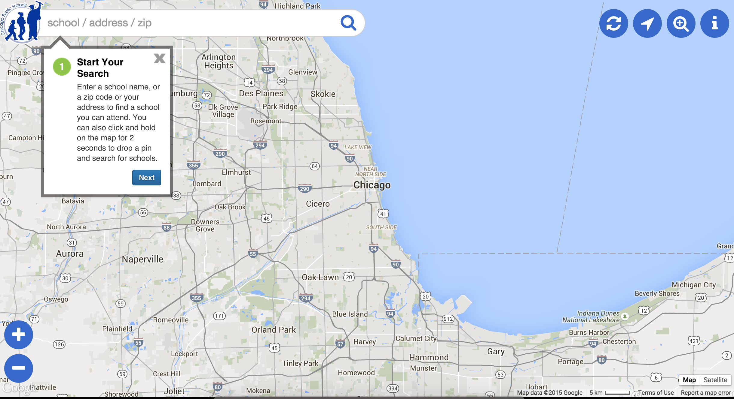
Other updates include users are now able to find schools quickly by using a new “Find Schools Around Me” button or by pressing and holding down on the map to drop a pin and see nearby neighborhood schools. The CPS website team also added Google street view functionality to have an interactive view of the school and its surroundings. Lastly, the “Compare Schools” feature allows users to compare different schools, so parents can find the best option for their child using information such as number of students, student performance, ratings, and more.

The biggest change we saw as a direct response from our CUTGroup testers having difficulties with the School Locator. The mobile layout of the School Locator page is now in a full-screen format, and users do not need to turn their mobile devices horizontally or move around the page to see all of the information they need. It is exciting when changes like this happen and the feedback directly from CUTGroup testers continues to be influential to websites and software that is so wide-reaching.

Final Report

Here is a final report of the results with the analysis of the questions we asked, followed by each tester’s responses, and copies of other questions we asked:

The raw test data can be found below with the written answers from every tester.

CUTGroup #14 – Chicago Cityscape

CUTGroup 14 Chicago CityscapeFor our fourteenth Civic User Testing Group session, we tested Chicago Cityscape, a website that helps residents understand how, where, and when building development takes place in neighborhoods. This in-person test took place at one of the Connect Chicago locations – Chicago Public Library Logan Square branch at 3030 W. Fullerton Ave.

The developer, Steven Vance, wanted to learn these things from the test:

  • Usability: Are there functions that are difficult to use or provide different information than expected? What do testers look at or do first when visiting the website? In what ways can Chicago Cityscape be improved?
  • Desired features: Steven wanted a better understanding of the type of information that residents and homebuyers look for when researching neighborhoods or potential properties to live in. What are the pieces of information that residents/homebuyers most interested in? What pieces of information are they least interested in?
  • Paid Services: Is there an interest in paying for these services at a low cost?

Segmenting

On January 30, 2015, we sent out an email to all of our 831 CUTGroup participants. We wanted to know if they would be available for an in-person test on February for about 30-45 minutes. We asked some screening questions to gather information. We were interested in getting residents who are involved and care about what happens in their neighborhood. We were also looking for people who were planning to buy a home. These homebuyers did not need to be as active in their community.

We ended up having 13 testers participate in this test.

Screening Questions

We heard form 62 CUTGroup participants through our callout for testers. We received a lot of good information just from the screening questions. Here is a look at what we learned:

  • 60% of CUTGroup respondents are currently renting
  • 37% of respondents are planning to buy a home in the next year

When we asked how involved testers are in their neighborhood, this is what we they said:

5 Very Involved                     23% (14)
4 Involved                          35% (22)

3 Neutral                                 31% (19)
2 Slightly Involved                3% (2)
1 Not at all Involved              8% (5)

Test Format

The format of this test was proctored sessions with proctors working one-on-one with the testers. Testers looked at the website using either their own laptops or laptops we provided while proctors asked questions and took down their responses. It was also the first time we used the software, ZoomText, which we added to one of the laptops for a tester who has low-vision.

Ever since the Roll with Me CUTGroup test, we have been trying to reach more people through the CUTGroup. Having a diverse set of individuals, such as low vision or blind testers, helps us better understand the structure and usability a website. For example, during this test, Architect Dropout (#11) tested using iPad voice-over commands. From that experience, Steven realized that the map failed because the voice-over commands selected each map tile individually and she could not select the specific pinpoints on the map. This led to a very detailed Github issue and conversation on accessibility improvements for Leaflet. This is a goal of CUTgroup — to not only uncover user experience issues on one website or app, but to help all developers build better websites that work for everyone.

Results

Information

12 out of 13 testers are interested in learning more about what is being built or torn down in their neighborhoods, and most look to community news outlets (such as DNA Info or Everyblock) for this type of information. When learning about a property, testers said that these are the most important pieces of information: property information, tax information, neighborhood data, and violations at that specific address.

When testers were asked to search for an address in their neighborhood, most of them searched for their home addresses and called out these pieces of data on the “Address Snapshot” page: demographics, Aldermen/ward information, property taxes, crimes, and then permits. While there was not a one-sided response to the “least useful information” question, a lot of testers had questions about the data they were seeing on the pages. Here are a couple of ways that testers would improve the Address Snapshot page:

  • Change up the design elements: 5 out of 13 testers mentioned changing elements of the color and design as ways to improve the Address Snapshot page. HomeSweet (#12) says, “Visually the page is rather simplistic and not in a way that makes it easy to read. It’s not immediately clear that the ad is an ad.”
  • Highlight or change information structure: 3 testers thought that information on the pages should change and different pieces of information should be highlighted. Testers also mentioned that there was a lot of information on these pages, and it would be better if they were organized with better definitions and descriptions.

When looking at the permit information, testers had an easier time navigating the permit information on the map versus the information listed on the community or neighborhood area. Testers again had a lot of questions about the data they were looking at, here are some examples:

“Are these permits already approved?” –Big on Community & IT Field #geekchic (#3)

“TIF district! I want to know what that is” –Non-Profit Pro (#6)

“What’s to be gained by showing the total estimated costs of the projects? What does change time mean?  How do you get access to the records? Do you have a way to get it quickly?” – Construction Watcher (#2)

83% of testers thought that the permit information was useful or interesting. Two testers wanted to compare permit data in their neighborhood to other neighborhoods. In addition, one tester, Chicago Explorer (#10), thought that seeing the history of the neighborhood through permits is interesting. If she was starting a business or looking for a property it would be especially useful.

Usability

For the most part, testers found it very easy to navigate the website. There was some confusion when ads had a light background and matched Chicago Cityscape. In addition, testers had questions about the map icons and had questions about the data types or the timeline of what was being displayed.

When first exploring the website, most testers did not an overwhelmingly clear first step or action. 4 out of 13 testers (31%) viewed or clicked on the map on the homepage, 3 testers (25%) typed in an address, while the rest of the testers did a variety of other first actions. In addition, when testers were first reviewing the homepage, 5 out of 13 testers (31%) were not clear who the audience was.

Audience

Throughout the test, testers mentioned useful and not useful information on every page and often distinguished which information would be useful to one group but not to others. As mentioned before, testers had questions about the audience ever since the start of the test.

Architect Dropout (#11) says, “It doesn’t seem super targeted to your average Jane, seems targeted to a business, not very consumer targeted… doesn’t seem to want to sell me anything, feels more like an industry site.”

Both HomeSweet (#12) and Big on Community & IT Field #geekchic (#3) said that they thought this was a real estate/homebuyers website.

Chicago Explorer (#10) and First time looker (#9) both mentioned the paid subscriptions on the “Find Permits” community or neighborhood pages. First time looker (#9) thought the paywall in the description stifles here curiosity. She hasn’t used it enough to make a decision – there is no information on a trial readily available, no free content on the outset, which turns her off because she doesn’t even know if it’s valuable to her yet. Chicago Explorer (#10) added that “Subscribe– doesn’t appeal to me, but would if I were a mogul.”

Chicago Cityscape has a great opportunity to teach residents about building/property information and permits and then provide a platform for residents to learn more about what is happening in their own neighborhoods. The best way that can happen is to continue to include definitions and descriptions of terms.

It is also important to consider audience for this website and provide the proper pathways for individuals to get the information that they need. Whether they are an involved community member, home buyer, or a contractor. Defining the purpose of this site and how this data is useful to multiple groups of people in the forefront (on the homepage) will give individuals the grounding to use the data provided.

Final Report

Here is a final report of results with the analysis of the questions we asked, followed by each tester’s responses, and copies of other questions we asked:

The raw test data can be found below with the answers from every tester:

CUTGroup #13 – mRelief

Receiving a text message from mRelief on a SamsungFor our thirteenth Civic User Testing Group session, we tested mRelief, a website that helps residents check their eligibility for social services benefits in Chicago and Illinois. This in-person test took place at one of the Connect Chicago locations – Chicago Public Library King branch at 3436 S. King Drive in the Douglas community area.

The mRelief team was interested in testing these things:

  • Language: We heard that language is very important in understanding if someone is eligible for social services. We wanted to see if testers understood terms such as: gross income (what to and not to include), value of assets, household size, etc. The mRelief team also uses pop-overs and wanted to see if testers use them and if they were helpful.
  • SMS: We wanted to test the text-messaging platform to see if users found it easy to use and how long each session took to receive and send messages
  • Website usability: In addition to testing SMS, we wanted to see how testers liked the mRelief website and how easy it was to use.

Segmenting

On January 21, we sent out an email to all of our 834 CUTGroup participants. We wanted to know if they would be available for an in-person test on January 29 for about 30-45 minutes. We asked some screening questions to gather information. We wanted to focus on testers who were currently enrolled in or qualified for social services programs. We also wanted to focus on residents of the Southside of Chicago

We ended up having 11 testers participate in this test. In addition, 1 individual from the library wanted to be involved in the CUTGroup, and therefore, we tested with him, but did not include him in the results because he would not have qualified for the test.

Screening Questions

We heard form 71 CUTGroup participants through our callout for testers. We received a lot of good information just from the screening questions. Here is a look at what we learned:

  • 90% of CUTGroup respondents said they have a smartphone
  • 33% of respondents are currently enrolled in social services programs

Test Format

Due to the personal nature of discussing social services benefits with testers, we decided early on that we wanted to do one-on-one proctoring. We had a total of 7 people from Smart Chicago and mRelief help with welcoming testers and proctoring.

This was the first test that we were not only testing a website, but also wanted to test the text messaging platform. Testers were asked to go through both processes, and we wanted to see how they compared and if testers found one platform easier to use than the other.

Results

8 out of the 11 testers were currently enrolled in social services benefits, and all of these testers were enrolled in Food Stamp benefits. The 3 testers who were not currently enrolled seemed to have qualified for social services benefits based on their household size and income.

 Language

We learned from this CUTGroup test that testers found the form(s) when checking their eligibility to be a simple process. 7 out of 11 testers (64%) mentioned that the questions were easy to understand or straightforward. Although most of the language was very clear, however, only 1 tester clicked on a pop-over to find out more information. Therefore, any question that requires additional help text should be added after the question.

In addition, some testers did not notice that some questions might ask for monthly income vs others that ask for annual income. These are key pieces of information that should be made clearer in the question format.

SMS

Out of 11 testers, 10 testers (91%) do not pay per text message.

Only 5 out of 11 testers (45%) thought that the questions were “easy” or “straight-forward” when going through the text messages. The biggest thing we heard was that testers were “frustrated” or “annoyed” that they were unable to fix a mistake and had to start from the beginning.

Lastly, some testers received messages out of order, and some terms were split up between messages (ex: “Medicaid”).

1 of our testers, Simple One (#9), experienced a delay between text messages that lasted anywhere from 1 to 2 minutes. She thought it was “annoying” that she did know when the end of the questions would be. 3 testers thought the process was pretty fast!

Website usability

When reviewing the homepage, 6 out of 11 testers (55%) mentioned the graphics. 3 testers felt that the icons were very intuitive and understood that they connected to the social services benefits. The other 3 testers did not think the icons were as intuitive. 4 testers thought the graphics were icons that they could click on.

Most of the testers had a clear direction after reviewing the homepage. The majority (9 testers) clicked “Get Started” while the other 2 testers clicked on “Programs.” It was great to see that testers had a clear path in using the website that got them to the most important part — checking their eligibility for social services.

When checking eligibility, we noticed that a lot of testers liked the idea of the calculator to calculate income, but most testers did not use if because they had already answered the questions before coming across the calculator located at the bottom of the screen.

Documents & More Information

We wanted testers to tell us how important it would be for mRelief to provide additional information about documents that they might need to bring, or money that they would receive from the benefit. We hoped this would be a help for mRelief to decide what the next steps for the website might be. Here is what we learned:

How important is it for you to know what documents you need to prepare for an interview with a caseworker to receive public assistance?

5 Very Important      100% (11)
4 Important                    0%
3 Neutral                         0%
2 Slightly Important     0%
1 Not Important            0%

Is it important for you to know why you do or don’t qualify for public assistance?

5 Very Important      82% (9)
4 Important                     18% (2)
3 Neutral                          0%
2 Slightly Important      0%
1 Not Important              0%

How important is it for you to know how much money you will receive from public assistance before going to file with a caseworker?

5 Very Important      46% (5)
4 Important                     9% (1)
3 Neutral                          9% (1)
2 Slightly Important      18% (2)
1 Not Important             18% (2)

How important is it for you to know how to file an application for public assistance?

5 Very Important      91% (10)
4 Important                     0%
3 Neutral                          0%
2 Slightly Important      0%
1 Not Important              9% (1)

Final Report

Here is a final report of the results with the analysis of the questions we asked, followed by each tester’s responses, and copies of other questions we asked:


The raw test data can be found below with the written answers from every tester.

CUTGroup #12 – Roll with Me

For our twelfth Civic User Testing Group session, we tested the Roll with Me, a website that helps residents find accessible transit directions in Chicago. This test had two components— a week-long remote test with an in-person discussion at our offices – The Chicago Community Trust at 225 N. Michigan Ave in the Loop.

Roll-with-Me-Screenshot

Mohammad Ouyoun developed Roll with Me during an internship with Smart Chicago and as part of the Civic Works Project. We sat down with Mohammad to see what he wanted to learn from the test. We focused on individuals who have difficulties with stairs, and Mohammad saw use of this website for people that have temporary needs such as parents with strollers, or individuals using carts or luggage. Here are the things that we really wanted to know:

  • How does Roll with Me work in user’s normal day-to-day? Is it easy to use on different devices?
  • How important are the alerts for users?
  • How does Roll with Me compare to other user’s methods of finding transit routes? What features are users interested in having?

Segmenting

On January 8, we sent out an email to all of our 837 CUTGroup participants. We wanted to know if they would be willing to answer a short remote questionnaire 2 or 3 times during a week, and then be able to come to an office in the Loop for an in-person discussion on January 20, 2015. We asked some screening questions to gather information. We wanted to focus on testers who have difficulties with stairs, and ended up with 7 testers who said they did. Since we were looking for more testers, we also reached out to an additional 8 testers who were heavy users of public transit to provide feedback about this app in comparison to other transit apps and websites.

We ended up having 14 testers participate in this test from different neighborhoods in Chicago. Here is a look at the neighborhoods distribution of the testers:

Screening Questions

We heard form 95 CUTGroup participants through our callout for testers. We received a lot of good information just from the screening questions. Here is a look at what we learned:

  • 67% of CUTGroup respondents use public transit on a daily basis.
  • 18% of respondents use public transit to travel to the suburbs on a regular basis (2 or 3 times a week)
  • 23% of respondents specifically mentioned using CTA tools (such as CTA Bus tracker) as their primary way of getting transit route information. 21% of participants mentioned Google Maps as their primary way to search transit routes.

Test Format

We asked testers to participate in multiple test parts over a week’s time. We were happy with the level of detail respondents provided in the quantitative remote portion of the test .

14 of the 15 testers we invited answered Part I’s questions via an online form. A couple of days later, 11 of those 14 testers also completed Part II questions. Then on January 20, 2015, 10 of the 14 testers were able to make it to the in-person section.

We wanted to have an in-person discussion that was casual and focused on qualitative responses. This was not a traditional focus group. The goal of this discussion was for Mohammad to ask questions directly to testers and get feedback. Through this format, we were able to discuss very specific features that testers were looking for.

Results

How does Roll with Me work in user’s normal day-to-day? Is it easy to use on different devices?

We learned that 71% of testers normally check directions on their mobile device. When talking about how it was to find directions, 50% of testers mentioned that it was simple, easy, or straight-forward.

Only 5 testers tried the “Find Me!” feature. 64% of testers did not try to use it and did not see it during their use of the website. Currently the “Find Me!” feature is not working, but once it is fixed, testers thought it should be larger and more prominent.

3 testers experienced problems with searching for their address due to the fact that their addresses came up in different cities rather than defaulting to “Chicago, IL.”

Also, testers were frustrated that when searching for directions they could not go back and edit the directions, but instead had to retype all of the information again.

How important are the alerts for users?

Roll-with-Me-Alerts-Screenshot

The majority of testers found the alerts to be very useful information, but a few testers thought that they were distracting from the route information. 3 testers thought it would improve the website if the alerts were moved from the top, center location.

Wheelchair CTA rider (#4) says, “I EXTREMELY like that the accessible info is available for the whole CTA system on the same page.”

During the in-person discussion, Writer Rider (#12) explained that she liked having all of the alerts because it brings attention to accessibility needs and the fact that routes might be unavailable due to construction or maintenance.

How does Roll with Me compare to other user’s methods of finding transit routes? What features are users interested in having?

During the first part of the questions, 5 testers (36%) wanted to see a map associated with their directions. 7 testers (50%) wanted to be able to input a custom travel times to get directions. The 15-minute intervals were not sufficient for testers.

For the second part of the test, we asked how important these features were to all of the testers:

How important is it for Roll with Me to display your directions on a map?

5 Very Important         9% (1)
4 Important                 55% (6)
3 Neutral                       27% (3)
2 Slightly Important    0% (0)
1 Not Important           9% (1)

How important is selecting a custom departure time when finding directions?

5 Very Important      55% (6)
4 Important                  36% (4)
3 Neutral                       9% (1)
2 Slightly Important   0%
1 Not Important          0%

How important is selecting a custom arrival time when finding directions?

5 Very Important     55% (6)
4 Important                 27% (3)
3 Neutral                      18% (2)
2 Slightly Important   0%
1 Not Important          0%

Roll with Me for Other Uses

We wanted to also see if Roll with Me could be used for residents who do not have mobile disabilities.

Blue Line + Buses Only (#10) says, “I think the name discourages people who might not be in a wheelchair but might appreciate accessible travel accommodations (ppl. uncomfortable taking stairs, who can’t go far distances on foot, etc.)”

How useful do you think Roll with Me is for people without mobile disabilities? Such as people with strollers, carts, or luggage.

5 Very Useful              27% (3)
4 Useful                       27% (3)
3 Neutral                    36% (4)
2 Slightly Useful         9% (1)
1 Not Useful                0%

Currently, Roll with Me does not specifically target these groups of people, but some testers did see the use of Roll with Me for people without disabilities.

Next Steps

Directions need to be easier to find.

We heard a few suggestions from testers to make finding directions easier:

  • Find me! Feature needs to be fixed and more prominent on the website.
  • Testers tried using cross streets to find transit routes, which either produced incorrect results or did not show any results. One suggestion might be to provide examples of how the address should be written on the homepage.
  • A lot of testers faced the same issue that when they started to type in their address, addresses started to show for other cities before Chicago. Since this app is limited to accessible transit routes in Chicago, testers wanted it to default to Chicago without having to type in city and state info. In addition, there was a bug when testers did not type in the full address.

Adding additional features

  • 90% of testers thought it was “important” or “very important” to have custom arrival and departure times when finding transit times.
  • 63% of testers thought it was “important” or “very important” to have a map to display directions.

We learned that most testers use other websites, such as the CTA Bus Tracker or Google Maps, and are looking for similar features in Roll with Me.

Final Report

Here is a final report of the results with the analysis of the questions we asked, followed by each tester’s responses, and copies of other questions we asked:


The raw test data can be found below with the written answers from every tester.

CUTGroup #11 – Expunge.io

Smart Chicago conducted our eleventh Civic User Testing Group (CUTGroup) test as part of our current work around this grant from the Knight Foundation given to Chris Rudd and Mikva Challenge to “update Expunge.io with new design and new features that will make the web-app more appealing and effective for its users.”

screenshot-expunge.io

Here are the questions we wanted to answer through this test:

  • Is Expunge.io easy to use? Do users like the website? Are there any problems/issues using the website?
  • What stands out on Expunge.io? What do users remember? Do users have a good understanding of the expungement process after visiting the website?
  • Do they want to share information with others?
  • How can Expunge.io be improved?

Segmenting

Instead of doing our normal callout to our CUTGroup participants, Mikva Challenge invited their youth to do a test on Thursday, August 28, 2014 from 4:30 – 5:30 PM. We had 7 testers show up to the Mikva Challenge Office at 332 S. Michigan Ave in the Loop. We figured that some of these youth might already know a lot about the Expunge.io website, but we still got great responses and suggestions for improvements.

We invited all of these youth to join the CUTGroup, it was optional for this test, but everyone signed up. Here is a look at what neighborhoods they live in:

View CUTGroup 11: Expunge.io in a full screen map

 Test Format

We did a focus group-style test with two 30-45 minute sessions.  One group had 5 testers, and the second group had 2 testers. Testers were asked to respond to the questions on their own, but proctors were at each session to ask questions and get more information and details.

Testers used this form to drive through the test and answer questions. We asked questions about internet and device use, knowledge of the juvenile expungement process, and website review.

We added a new task to the test to gauge whether something stood out to testers after viewing the homepage. After testers reviewed the homepage for the few moments to answer a previous questions, we asked them to turn off their laptop screens and draw what they remembered. Here is a look at their drawings:

Results

We learned that testers like Expunge.io because it is a simple, easy to understand website that clarifies the juvenile expungement process.  It’s not about the technology, but instead about sharing and getting information in order to get more juvenile records expunged.

Is Expunge.io easy to use? Do users like the website? Are there any problems/issues using the website?

The majority of testers thought that Expunge.io was really easy to use. The language on the website was described as “plain” or “simple” and testers thought the steps made it easy to follow.

6 out of 7 testers (86%) liked the website, and the 1 tester who did not like the website was “in between.”

The biggest issue that needs to be addressed is the fact that some users cannot get through the step-by-step expungement process on the website because of access being restricted by parental controls. This happens to be the case when the links have language that includes “adult:”

  • http://www.expunge.io/adultrecord
  • http://www.expunge.io/adultorjuv

Since this website is driven by youth, it is important that youth can access the website at schools and at home and these links should changed so they will not be flagged by parental controls.

What stands out on Expunge.io? What do users remember? Do users have a good understanding of the expungement process after visiting the website?

When testers were asked to draw the homepage, 6 out of 7 testers remembered the three boxes/steps. These testers, however, were not able to recall the steps specifically or what each step is.

The two pieces of information that really stood out for testers was the fact that there was a cost associated with the expungement process and that you needed to be over 18 before your record was expunged. During the session, some testers felt like this information needed to be better represented at the beginning of the process. Even though there is a fee waiver, testers were stuck on the fact that they would have to pay for the expungement process. Some testers felt that if they are sharing this with their peers and friends, they would not want this type of information to be “hidden.”

Do they want to share information with others?

6 out of 7 testers generally share information through social media on regular basis. When asked if they would be willing to share information about Expunge.io, all testers were willing to share information to help their friends and the people they know.

When asked to draw the homepage, only one tester noticed the social media icons on the bottom of the page.

MJ (#6) thought that if you do not have a record, “There should a page where it says something like ‘Congratulations! You don’t have a record! Here’s what you can do to help others…”

By providing users a clear call to action would allow more users to help others by sharing information.

How can Expunge.io be improved?

Access Restrictions

We learned that through this test that links that have the word “adult” triggers the parental controls and restricts access to the website. Since this is a youth driven website, all links need to be changed to have youth-friendly language so youth can visit Expunge.io at any location.

More information about process

Testers wanted more information about the expungement process cost, fee waivers, and the age restrictions to be more noticeable at the beginning of the process. Most testers felt that if they are sharing this type of information with their friends, it should not be “hidden” in the website but be clear and upfront.

Polar Bear (#3) said that the website needs to “be more specific especially if one that isn’t 18 and can’t do this will want to know from the start.”

More information found in the FAQs should be added to the homepage.

Call to Action

Testers were very interested in sharing this information to their friends and peers because they thought it was important to “help.” Social media should be used more often as a call to action. On this page, as an example, even if the youth is not eligible to apply for juvenile expungement, there should be a call out to share with their networks to spread information about the juvenile expungement process.

Screen Shot 2014-10-23 at 12.39.29 PM


Smart Chicago will be working with the  Mikva Challenge Juvenile Justice Council to share these results and prepare for two additional tests with youth for Expunge.io. We hope to help create a plan to make this website work for more people.

Final Report

Here is a final report of the results with notes from each CUTGroup test session, followed by each tester’s responses, and copies of other questions we asked:

The raw test data can be found below with the written answers from every tester.


CUTGroup #10 – Build it! Bronzeville

For our tenth Civic User Testing Group session, we tested the Build It! Bronzeville app, which is a mobile game app that uses GIS technology to help residents guide development in their neighborhood as they complete quests (i.e. enhance safety, visual appeal, and foot traffic). This in-person test took place at one of the Connect Chicago locations – Chicago Public Library Chicago Bee Branch at 3647 S. State Street in the Bronzeville neighborhood.

Team_Build_It_Logo

Build It! Bronzeville was a Winner of CNT’s 2013 Urban Sustainability Apps Hackathon competition, and this CUTGroup test was a part of the prize package. If you are building applications to make lives better for residents of Chicago you can sign up here for a CUTGroup test of your app. This is one way Smart Chicago supports development of innovative civic applications through developer resources.

Through this test, we were interested in finding answers to these questions:

  • How do users play games? How frequently?
  • How would users feel about registering ?
  • How do people want to contribute in the game (check-ins/receipts)?
  • Do users see a community impact from this game now?
  • Are they having fun?

Segmenting

On June 20, we sent out an e-mail to all of our 764 CUTGroup participants. We asked them if they would be willing to test a neighborhood game app on June 25, 2014. We asked some screening questions to gather information, and chose our group of participants based on a diverse selection of answers. The app was available only to Android users, and we segmented testers by Android phone and tablet users. We wanted to focus on getting testers in the Bronzeville or South Loop areas, but were open to other neighborhoods.

We confirmed 14 testers but only 6 testers ended up coming to this test. There was not a clear reason for why testers did not show up for this test. The furthest a tester traveled from their home location was 11.02 miles.

Here is a look at which neighborhoods our testers came from:

View CUTGroup 10: Build it! Bronzeville in a full screen map

Test Format

This was an alpha-test of the app which focused on three levels of a game. We wanted to see if testers understood the game, if they liked the design and playing, and if they like the element of sharing receipt data to get in-game benefits.

For this test,  it was important that Smart Chicago and part of the Team Build it! proctored the testers one-on-one to monitor tester’s actions and take notes on commentary and bugs. We advised the developer and team not to tell testers that they helped develop the app in order to receive unbiased advice from our testers.

Results

This CUTGroup test was the first time Smart Chicago tested an app in the early stages of development, and it was also the first time we tested a game app. We were excited to learn about how testers play games and what aspects they enjoyed the most. We were also very interested to learn how the community connection of this game affects if users are more inclined to play.

All of our testers brought Android phones to the test, and 5 out of the 6 testers were able to test the Build it! Bronzeville app.

How do users play games? How frequently?

We learned that the majority of testers play games on a daily basis, and normally play while they are commuting. On average, testers had 3 game apps on their mobile devices. Two testers mentioned they like to play puzzle games, while other games that were mentioned include: Threes, Piano Tiles, Farmers vs. Zombies, Candy Crush, Angry Birds.

Only 1 tester mentioned that they do not play any games on their mobile device due to a lack of time.

When we asked testers if they liked to connect to social media, 3 testers (50%) said they connect with social media on mobile games, while the other 3 testers (50%) chose not to. Privacy was a main reason to not connect with social media, since testers do not want the app to post about game play on those outlets.

3 out of 6 testers (50%) mentioned that they stop playing a game when there is nothing new or challenging in the game.

How do users feel about registering?

Two testers had problems connecting to the game on their app – MBA Girl (#4) was using a Samsung S4, while Spoung45 (#5) was using a Samsung Note 3. Spoung45 used the developer’s device to complete the test.

All of the testers (5) who were able to complete the test thought that signing up on the app was easy. There were three recommendations from testers to make signing up easier or better:

  • Text should be bigger
  • Password should be seen as she types and change to symbols
  • It would look better to be embedded in the screen rather than being a pop-up

After registering, two testers had an issue with their keyboard remaining stuck on the screen and having to close the app and restart.

How do users want to contribute in the game (check-ins/receipts)? Is there any hesitation with privacy when users are asked to share receipts?

Testers prefer to contribute to the game by checking in at local businesses versus taking photos of the receipts.

3 out of 5 testers (60%) said they would share receipts by taking photos. 1 testers who did not want to share receipts thought this was a “weird” option, while another tester did not think this benefit was fair due to individual habits and if youth want to play they might have receipts to share.

All of the testers said they normally keep their receipts on them.

4 out of 5 testers (80%) would check-in at local businesses to get in-game benefits. Both testers who would not share receipts were willing to check-in at local businesses. 1 tester who did not want to contribute by checking in said it was because she normally plays games in transit.

Do users see a community impact from this game? Do users enjoy this element? Is community involvement important to their game play?

The majority of testers liked the community improvement element of the game, but 2 testers wanted more context about why the game is set in Bronzeville and an understanding if the game levels match real, existing Bronzeville blocks.

“I always wanted to see how neighborhoods interact with each other and how money might be taken from one neighborhood to another.” – Music Lover (#1)

When Telephober (#6) saw the description for sharing receipts, she thought that sharing receipts would be “totally worth it” since it “helps the community.”

Nathalie (#2), wanted not only to contribute to what gets built in a neighborhood but also hear feedback from residents:

“The levels were sort of limiting… there’s not really a feedback loop from citizens… I would like to know if residents are happy with two salons on the same block.”

3 out of 5 testers (60%) said they would be more inclined to play the game if players are rewarded by spending at local businesses. Casual Gamer (#3) really disliked the receipt part of this game, and thought that the developers should “get rid of the creepy receipt scanning issues.” Casual gamer is interested in a story behind the levels and making money in the game versus to helping the community.

When testers were asked what they decided to build, 3 out of 5 testers (60%) built building based on community needs.

By adding more context to each level about the neighborhood in connection with other neighborhoods through Chicago, and an understanding of real lot vacancies in the neighborhood would provide users a well-rounded understanding of each level and the purpose of the game in general.

Are users having fun?

4 out of 5 testers (80%) thought the levels were fun, and were reminded of other games such as Cityville and Roller Coaster Tycoon. Testers preferred more realistic graphics seen in level 2 over the very basic and simple graphics in level 1. Here is a look at the graphics in level 2:

lvl2Graphics

Music Lover (#1) describes this game as “Edutainment – Educating and entertaining at the same time.” She likes that this game could prompt someone to think about their neighborhood and about what it does and does not have.

Next Steps

View and graphics

Testers preferred the more realistic graphics seen in level 2 over the basic/simple graphics of level 1. During the levels, most testers had difficulties tapping the lots, and clear boundaries of lots should be added.  Most testers were also unaware that they could move around on the map, and wanted to zoom out to see the full block.

Bug fixes

Since this was an early test of the game, there were a number of bugs that testers faced, specifically:

  • Samsung S4 and Samsung Note 3 both could not load the app
  • Keyboard stayed open after signing up and could not be removed without backing out of game entirely
  • Lots would not “pop” when tapped
  • When taking a photo of a receipt, screen remained stuck on “sending data” action

More information

Overall, testers enjoyed playing Build it! Bronzeville, but wanted more background information about the game. Providing context about why this game is in Bronzeville and the spending at neighborhood businesses in the tutorial would give users a firmer understanding about the purpose of the game.

In order to make the game easier to use, more tutorials or descriptions of icons and features should be added:

  • All icons should be described including the money and people status bars
  • Better information about how money is generated
  • More information about the building types
  • A story or information about overall goal of game
  • Information in relation to whether or not these are blocks in Bronzeville
  • Tutorial for gem store once money runs out

Build it! Bronzeville is an opportunity for users to think about what their neighborhood lacks, and offer suggestions on how to make their neighborhood better. By providing a story and information about the type of information gathered, will build a strong community element for users.

Final Report

Here is a final report of the results with notes from each CUTGroup test session, followed by each tester’s responses, and copies of our e-mail campaigns and the questions we asked:


The raw test data can be found below with the written answers from every tester.