 For our twenty-first Civic User Testing Group (CUTGroup) session, we conducted focus groups to have conversations with residents about their access to digital skills trainings and resources. We wanted to see if residents know about the the resources in their own neighborhood and how they prioritize gaining new skills that center around technology.
This was a different topic for a CUTGroup test, but as we build more technology, we saw incredible value in talking to people about their digital skills. From this test, we wanted to understand
- How people talk about digital skills in the context of their lives and goals
- How much they prioritize improving their digital skills
- If they know of resources available to them or have used them
- How easy or challenging it is to access or take advantage of those resources
- Challenges that people face when it comes to accessing the Internet and technology and getting to their goal
We wanted to use this information to shape the new Connect Chicago website and gather some qualitative information on how Chicago residents think about and deal with these issues. Connect Chicago aligns citywide efforts to make Chicago the most skilled, most connected, most dynamic digital city in America. The Connect Chicago network includes more than 250 locations offering training, devices, Internet access, and helping residents engage with technology. Denise Linn, Smart Chicago’s Program Analyst, runs the Connect Chicago initiative and was key in designing this test, writing questions and helping take notes during the sessions.
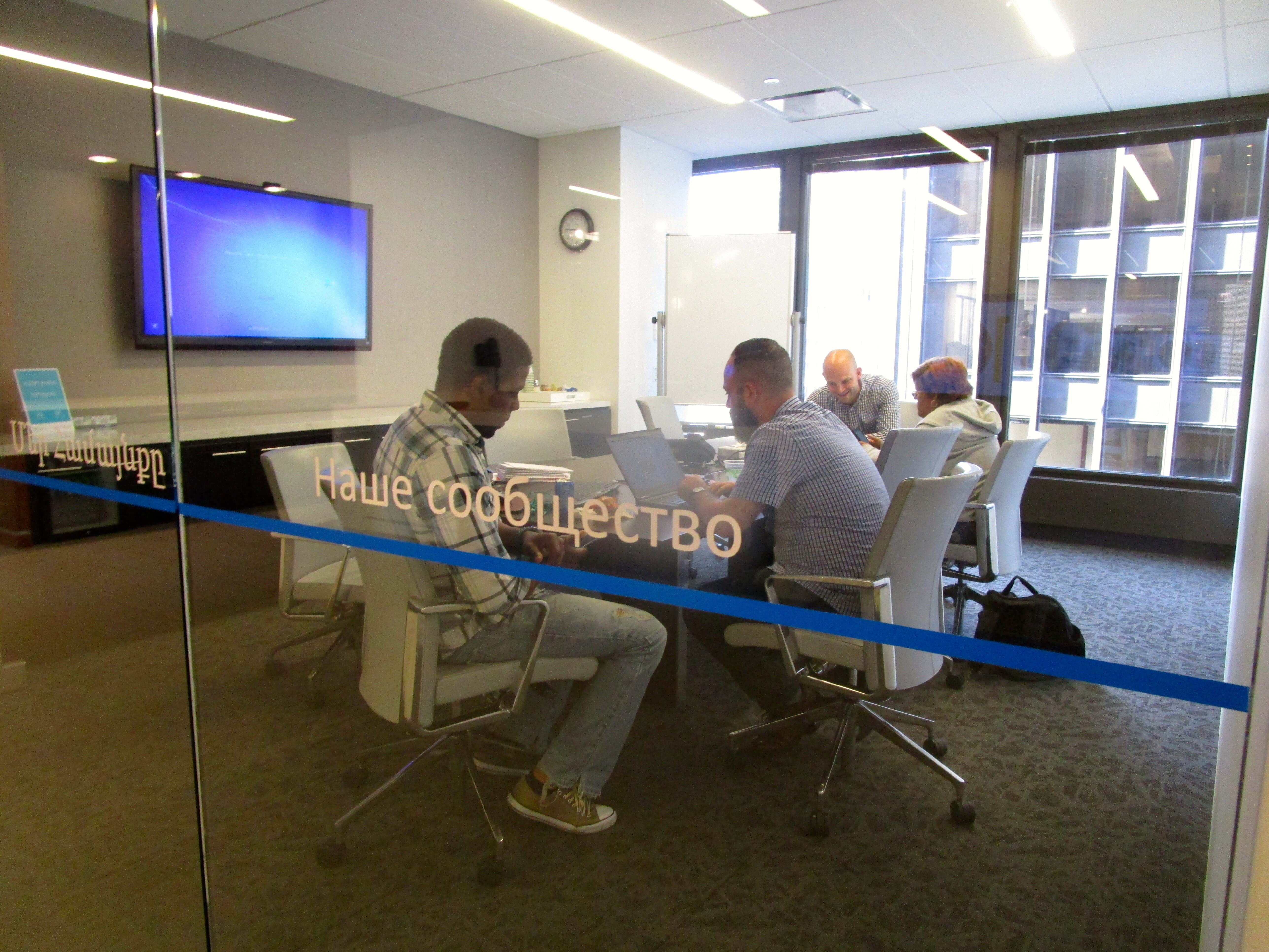
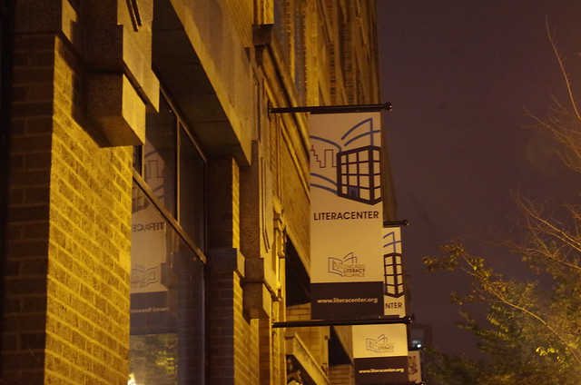
This in-person test took place at Literacenter, a collaborative workspace dedicated to literacy organizations, located at 641 W. Lake Street. We chose to test here because it is a comfortable and flexible environment for testing and Smart Chicago is a member of Literacenter!
Segmenting
On October 20, we sent out an email to 941 CUTGroup testers who are Chicago residents. We wanted to know if they would be available for an in-person test on October 28 for about 45 minutes. We asked screening questions to gather information about how comfortable people felt using technology, whether or not they participated in digital trainings, and what types of skills they wanted to learn.
We looked through all of the responses and wanted to choose testers who did not have advanced digital skills. This meant not selecting testers who had coding skills, had advanced technology related degrees, or used sophisticated software systems for work or personal use. We wanted to reach people who had lower skill sets and might be interested in additional trainings or resources to improve their skills. We also thought testers would be more comfortable if they were grouped with others who were close to their own skills level. 14 CUTGroup testers participated in our focus group sessions.
Responses to Screening Questions
71 testers responded to our screening questions. Here are a couple of things we learned:
- 28% of respondents said it is “Challenging” to use technology or learning new skills
- 94% of respondents “Agree” or “Strongly agree” to this statement: “I feel comfortable using computers & technology” and the skills mentioned ranged from using email to coding.
- 96% of respondents “Agree” or “Strongly agree” to this statement: “I want to learn new computer & technology skills”
- Only 42% of respondents “Agree” or “Strongly agree” to this statement: “I am familiar with where computer & technology resources are in my community”
- 70% of respondents participated in a computer or technology training class or program
Test Format
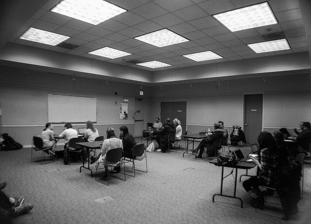
When designing this test, we chose to conduct focus groups. We were worried that conducting one-on-one interviews, we (as interviewers) would be influencing the responses and we were interested in participants talking with one another about their experiences. We thought there will be a lot to gain from those interactions that was worth the risk of participants influencing each other. For example, group interactions could capture a sense of community expectations about technology resources as well as the language and framing testers use while conversing about digital skill-building in Chicago. As the moderator, I played the role of asking questions, ensuring everyone had a chance to talk, and keeping the conversations away from being negative.
Before the focus groups, all testers completed a pre-survey questionnaire about the technology tools that they used. This helped us capture individuals responses before conducting the focus groups. We opted to ask many of the more personal, targeted questions about skill levels during this individual pre-survey questionnaire so as to formally capture that data and avoid putting testers on the spot during the focus group. For the focus groups, I used this script to guide the conversation, although we asked additional questions depending on the conversation.
Results
Pre-survey
In the pre-survey, we learned what technology testers are comfortable using, what they want to do better, and what skills they are or are not interested in learning. All of our results from this pre-survey can be found here.
We learned that testers felt most comfortable with these tools and skills: emails, creating a text or slideshow document, search engines, shopping online, and using Facebook and other social media outlets. We also learned that testers wanted to learn how to (better) do these things: creating a spreadsheet, using data visualization software, or learning how to code.
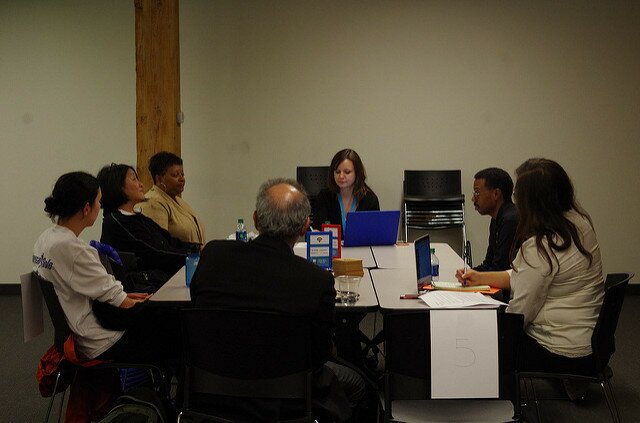
Focus group #1
Our first focus group had 5 testers and we began the conversation with how these testers use technology in their own lives either personally or professionally: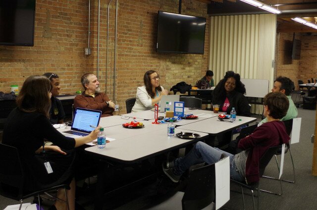
Tester #16, “Graphic Artist,” shared that he uses a laptop to do banking online and used to be in the graphic design industry and sometimes freelances but hasn’t learned the recent graphic software versions.
Tester #15, “techgeek,” uses mobile delivery apps like GrubHub and Caviar.
Tester #12, “GF,” works for a Chicago River kayaking company and uses Apple products for work, but uses Windows products for personal use and collaborative tools like Google docs help them transition between those platforms.
Tester #17, “Nonchalant,” responded to this question with “My job is to go to school!” but mentions that he checks his emails frequently.
Tester #14, “Rogers Park,” told us that he works in retail so he doesn’t use technology much for work, but appreciates this because he can interact more with people. Outside of work, he uses the Internet to manage their bank account, finances, and retirement funds and “stares at social media.”
Family networks rely on one another to teach digital skills.
Our conversation with this group focused a lot on the topic of how we use technology in a family setting. This first started from Tester #14 who does not appreciate that everyone is always connected in their family and we continued with how the other testers see technology being used in their families. While we heard a lot of experiences of technology creating a disconnected feeling because family members were on their own devices, we also learned about how teaching technology was a family activity.
Tester #17 helped his dad understand Facebook and “it was hard.” Now Tester #17’s dad is on Facebook and tags him “20 times a day!” A few testers shared their experience about teaching their parents to use social media, but two testers also had parents who had more advanced technology skills, like Tester #12’s mom building her own computers, and taught them a new skill.
Tester #16 bought his father an IBM computer, then an iMAC computer, and tried to teach him how to use the Internet so the family could contact him in Puerto Rico more easily. Tester #16 thought teaching his father was extremely challenging and that it might be “too late” for his father to learn how to effectively use this hardware.
Challenges in learning new technology derives from a feeling that technology is always changing, and maybe it’s changing too quickly to keep up.
In every focus group we conducted this evening, we wanted to talk about the challenges in learning new technology. While not all testers were at the exact same digital skill level, this group saw the challenges in learning digital skills as keeping up with new technology, remembering what they already learned, and devoting time to learning. “You have to catch the train,” described Tester#17 when talking about the speed of changing technology.
A few testers talked about Excel specifically as something that is difficult to learn. Tester #14 shared that “Memorizing formulas is hard. I really want to learn Excel…it seems so simple, but it’s not.” Tester #15 said that learning Excel was very challenging in school and said that if they had “someone right there,” some human interaction, then learning would be easier.
Tester #12 uses online coding courses, ex: Code Academy, to try to learn how to code but says that it is challenging to a complete a lesson and then go back to the series later and remember what they learned beforehand. “I wish there was a classroom experience like that for adults.” Tester #12 expressed a preference for learning technology skills in a classroom setting: “If I had a teacher, I could learn how to code.”
We continue to hear how much testers value human interaction when learning new digital skills and technology courses and saw an in-person class or instruction as necessary to be successful.
Focus group #2
Our second focus group also had 5 testers and we started again with how these testers use technology in their own lives either personally or professionally:
Tester #24, “Ready to learn,” said that at work they are on their PC using Excel and Outlook. Outside of work, she goes to “fun” websites, researches on Google and sometimes uses Facebook.
Tester #22, “Like to discover useful tools,” shared that they use the same tools in the same way in their personal and professional lives. “My work doesn’t require a lot of complex calculations.”
Tester #21, “I love learning,” uses eBay and Microsoft products.
Tester #25, “Not Dead Yet,” uses Microsoft, Google, and some communications software at work. While at home they read on their Kindle, pay bills online and manages other finances with technology, and play games on the Internet.
Tester #27, “Involved,” says he does data entry for work and mostly uses Excel. At home, he uses Word and websites like Google, Youtube, and Amazon.
There’s not always a clear technology goal, but keeping up is important and the format of instructions or resources might depend on what they want to learn.
Unlike the first focus group, this group did not share clear technology or digital skills goals. When asked what they wanted to learn, no software platforms or hardware was mentioned specifically. We did hear from some that testers wanted to “keep up” either with their children and family, or with job-related technology skills.
Tester #25 said his goal is to go paperless at home and is in the process of using different tools to scan all of his documents and receipts into one place to manage his finances.
When I asked testers about where they would go to learn new skills, Tester #22 shared that “You can learn almost anything on YouTube.” The example used was when you get a new phone, you can see videos online on how to use them from opening the box.
Testers #21 & 27 would rather go to a class because they prefer person-to-person contact and wants to ask questions. Tester #21, somewhat jokingly, added that “I have kids. They are my personal tutors.”
Tester #24 explained that if they need to know something quick or “one-off” (like fixing something) she would Google it, but if she wanted to learn a whole new skill or system, then a class would be best.
Technology classes could be organized around common problems, not tools.
When we talked a bit about ideal technology classes, we heard that some testers were interested in classes being organized around common problems that people experience which could be solved by technology or computer skills. Tester #22 brought up this idea and thought that this would be practical for class recruitment. Here were some ideas: “Make a will,” “Collect and organize recipes online,” or “How to go paperless at home.”
Tester #21 agreed that this approach is more emotional and personal to prospective testers.
Focus group #3
Our last focus group had 4 women testers, who had more advanced skill sets than we saw in the other groups. We started again with asking how these testers use technology in their own lives either personally or professionally:
Tester #37, “Almost Advanced,” said that at home she use she telephone, TV and tablets, and at work they use tablets. Tester #37 took a Microsoft Excel class at Association House.
Tester #32, “Striving for literacy,” said that they use completely different devices at work and at home because of company policy. Tester #32 works at Motorola and they have to separate their personal online activity from their work online activity. She says she is slow to adopt in their personal life, but at work, she is eager to learn new tools: “If it’s at work, I want to learn and improve.”
Tester #31, “Recent Upgrade,” said that they had a similar situation as Tester #32, and observed from other answers that people often don’t adopt new technology, but they are pushed into it, especially at work.
Tester #34, “Reluctantly Tech Addicted,” said that they try not to use technology at home at all. They spend over 40 hours a week in front of a screen for work and don’t want to add to that. Tester #34 commented that there’s always new technology to learn at work and often work provides poor training without a reliable person to turn to for questions.
There were uncertainties when we asked testers if they consider themselves “tech-savvy” and those answers sometimes changed when they heard from others.
In the screening questions, we asked testers “When you think of the most tech-savvy (or technically advanced) person you know, what can they do that makes them so good at using technology?” We were interested in what ways is a person technologically savvy and if that because of the tools they use, the skills they have, or the general comfort level they have in learning new tools. Some responses from the screening questions included knowing how to code/create a website, being able to use different hardware, learning new skills quickly and then being able to teach others, technology coming as second nature, or just based on experience.
For this focus group, I specifically asked this group if they considered themselves “tech savvy” especially since we had a group of all women who based on their screening questions we did not think were as advanced in their tech skills. I was not sure if that was because they did not rate themselves as high in describing their skill set or if there was another reason. 3 out of 4 of these testers said they were “tech savvy,” but tester #37 said they thought they were tech savvy, but listening to other experiences, she changed her mind and said she wasn’t tech savvy. “I know the basics – Microsoft.” Even before she did the focus group her tester profile name was “Almost Advanced” and she participated in multiple digital skill trainings. The other women in this focus group immediately jumped in saying that having skills in Microsoft Office is not basic.
Later in the conversation when we discussed taking classes to learn new digital skills, Tester #37 said she took a basic computer class at an organization near her home even though she knew Microsoft Word and some of the skills they were teaching. I asked why she chose a class when she knew the software that was being taught, “Why start at the beginning?” Tester #37 shared that certifications are important because it impacts how much you get paid. She also shared that “I figured there might be something I didn’t know,” and she received a free laptop after taking the course.
Connecting residents to resources
Our final goal for this CUTGroup test was to understand how we can better connect residents to technology resources in their neighborhood.
The majority of these testers were interested in taking in-person courses where they could have personal support. Taking an in-person course over an online course, however, was dependent on the subject matter. Testers described many resources that could be found online but online resources are mainly useful for learning a quick skill (fixing something quickly) not an entire skill set like learning a new software platform.
Testers are looking for free classes that are in their neighborhood, and not everyone is aware of the resources that are near them. In the second focus group, we discussed how free classes are generally basic classes and there are not as many intermediate or advanced courses available for free.
Connecting residents to resources is dependent on marketing of those resources. In our last focus group, we talked about cross-collaboration between organizations. If you participated in a class at one organization, those staff could and should help determine the next class you should take based on your new skill set. This extra guidance is key to driving learners to continue their trainings.
Testers are not sure how to rate their skill set and need guidance in determining if a new class is right for them. As an organizer and designer of this test, I found it is hard to rate the skill levels of others and rating your own skill level is even harder. Guiding residents to know what is the best class for them is extremely important and can be done in multiple ways:
- Digital skills certifications provide a structure towards the next step in the learning continuum
- Instructors or trainers at organizations can provide better information to their students on next steps even when that class is outside of their organization
- Showcasing what benefits come from learning digital skills whether that is progression in skills or work-related can encourage new residents to participate
- Being transparent in the class documentation and syllabus will allow residents to review and determine if the class is too advanced or too easy based on what they already know
At Smart Chicago, we are excited to incorporate the ideas of this CUTGroup test into our Connect Chicago project and create news ways of talking about digital skills trainings and finding ways to help residents learn technology to improve their own lives.
Other Documentation
Here is a link to the notes from our focus groups that shares all of the topics we discussed during this test.
Here is the raw data of the pre-survey results:
Here is a link to our photo album from the test:
 For our thirtieth Civic User Testing Group (CUTGroup) session, we tested the current Chicago Park District website. The main goal of this test was to understand the user experience in preparation of an upcoming re-platforming and redesign of their website. We wanted to understand how users currently navigate this website when completing tasks, specifically searching for information. We wanted to understand how users search for information and what improvements would make search and navigation easier.

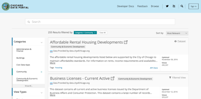
 For our twenty-eighth Civic User Testing Group (CUTGroup) session, we tested the newly redesigned homepage for the City of Chicago’s Open Data Portal.

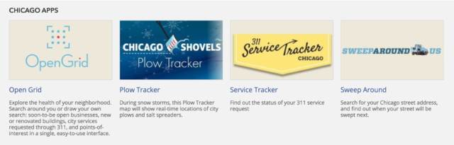

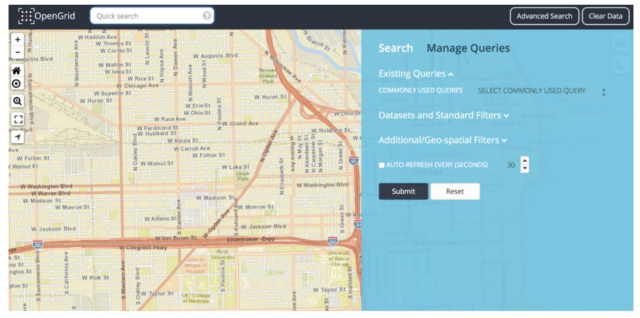
 For our twenty-fourth Civic User Testing Group (CUTGroup) session, we tested OpenGrid–