CUTGroup #7 – EveryBlock iPhone App

EveryBlock iPhone App ScreenshotFor our seventh Civic User Testing Group session, we wanted to get feedback on the EveryBlock iPhone app after EveryBlock relaunched on January 23, 2014. This in-person test took place at one of the Connect Chicago locations – Chicago Public Library Mayfair Branch at 4400 W. Lawrence Avenue in the Mayfair neighborhood.

EveryBlock lets you follow neighborhoods and get information about what is happening around you. From the EveryBlock Web site:

“Our goal is to help you be a better neighbor by giving you frequently updated neighborhood information, plus tools to have meaningful conversations with neighbors.”

We were interested in answers to these questions:

  • Are there any problems using the iPhone app? Does the app crash?
  • Do users have an easy time posting or commenting on the app? Do they find things they want to comment on?
  • Do users like the different pages in the app?
  • Would users use this app and in what scenarios might they post or comment? Would they use it “on the go”?

Segmenting

On February 5, we sent out an e-mail to 269 CUTGroup participants who said they had an iPhone as their primary or secondary device. We asked them if they would be willing to test a neighborhood app on February 10. We also asked some screening questions to gather extra information, and chose our group of participants based on a diverse selection of answers.

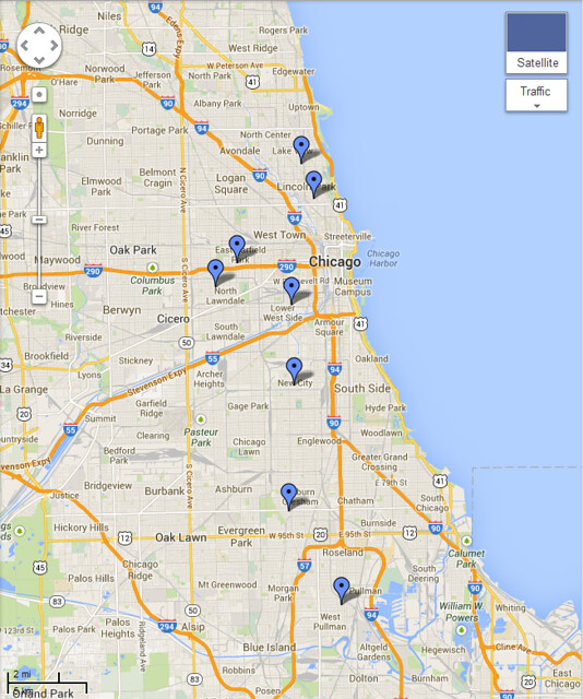
Here is a look at the distribution of iPhone users in our CUTGroup:

View iPhone Users for CUTGroup 7 in a full screen map

We were interested in having about 15 participants from different Chicago neighborhoods. We had 12 testers who came from neighborhoods across Chicago including Albany Park, Hermosa, Edgewater, Uptown, Logan Square, Auburn Gresham, and more. The furthest a tester traveled from their home location was 15.3 miles.

View CUTGroup 7 Participants in a full screen map

Test Format

This in-person test was the first opportunity we had for every tester to be paired with a proctor. In previous tests, some testers were paired with proctors, while others would complete answer questions about the Web site or app through an online form.

Smart Chicago and EveryBlock staff (including a developer who worked on the app) acted as proctors for this test. We understood that there might risks in having EveryBlock staff ask questions to testers since biased responses might be captured. We asked that all EveryBlock staff not introduce themselves as staff or indicate that they were associated in any way to the app.

We received both positive and negative feedback from testers even with this format. We value this opportunity for developers to be involved in the CUTGroup process. The open communication and active involvement between developers and residents are key in developing Web sites and apps to improve lives in Chicago.

Results

Are there any problems using the iPhone app? Does the app crash?

92% of testers liked the EveryBlock iPhone app, and most testers thought the app was easy to use. 4 out of 12 testers (33%) experienced a bug when using the app.

After signing up or opening the app, two testers experienced bugs on the first “Timeline” Page.

  • Victoria P Test (#4) did not have anything populate on the “Timeline” page. Content appeared in mobile web but not in the app. Victoria P Test was able to see content on “Near You Now” page
  • Software Breaker (#10) had an error message appear saying there is a problem connecting to EveryBlock

The app crashed when Amateur Student (#12) clicked on the New Post icon. In addition, the app crashed when Application Developer (#2) hit “Account Settings.” Once she made a post, the app did not redirect her to a new page, but instead went to a black page.

Do users have an easy time posting or commenting on the app? Do they find things they want to comment on?

New Comments:

  • In regards to making a comment, 58% of testers found a post they would want to comment on. Most testers thought it was easy to make a comment and was similar to other apps
  • 42% of testers did not want to make a comment. Some testers were not comfortable making comments, while others addressed privacy issues in making comments. One tester found a post that she might comment on, but the post was not formatted for comments
  •  One tester explained that they “feel like not much of a contributor.” For many testers, the decision not to make a comment is due to personal use of apps and Web sites. Two testers specifically were concerned about privacy on EveryBlock. A suggestion from a tester is clarity and options to change how names will appear on posts and comments

New Posts:

  • 75% of testers liked the new post interface, and when asked what testers would want to post about half of the testers mentioned specific neighborhood news: neighborhood concerns, crime warnings, traffic, weather, favorite places, garage sales, missing pets, events

Do users like the different pages in the app?

67% of testers thought that “Timeline” was the most useful page. As mentioned before, two testers did experience problems with this page, and this number could be even higher if these issues did not appear.

  • Testers liked this page the most because it showed the most relevant information. Testers were also interested in the “Near You Now” page when “on the go” to learn more about other neighborhoods
  • One tester wanted to add more zip codes to follow through the app to create a more personalized experience

Would users use this app and in what scenarios might they post or comment? Would they use it “on the go”?

83% of testers liked the option of making posts on the go, 17% of testers were not sure if they would like it or thought they might use it rarely. The majority of testers thought this was a convenient option, and wants to comment on things while they are happening. One tester commented that she is a Twitter user and is used to this concept.

What do users want to see in the EveryBlock app? 

While 75% of testers used EveryBlock, none of the testers ever used the iPhone app. Therefore, some testers had knowledge of the EveryBlock Web site and could compare these experiences. Testers who were familiar with the Web site were interested in having these features:

  • Search feature
  • Filters or an ability for users to choose what they want to see
  • Bookmark feature to read posts later
  • User Profile – more apparent and have incentive to contribute and “gain status” in the community
  • More information on Community Guidelines & Privacy
  • Address finder and map capabilities to help find locations

Here are some other suggestions:

  • Testers who did not use EveryBlock in the past were still interested in personalizing their experience.  These testers also wanted to see features like filtering, search bars, and an option to delete irrelevant posts from the feed
  • Two testers would like to see dates and times on posts to see if posts are the most relevant
  • 67% of testers were interested in sharing posts on social media
  • More information on privacy is important to testers. There should be options to see how much personal information is being posted, and to change privacy features within the app


CUTGroup-7-EveryBlock-Privacy

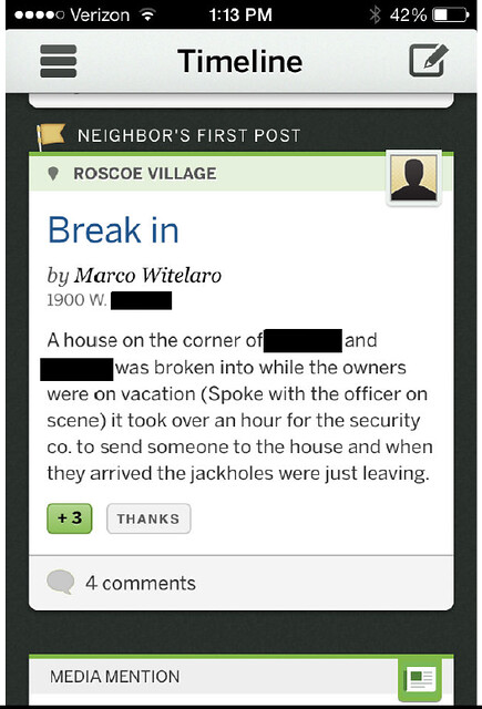
One tester was shocked to find the post above during the test about a break-in because it included the poster’s full name and the address. This tester was concerned for her own privacy and was interested in knowing how her information would appear before she posted or commented.

Conclusion

Testers generally had positive experiences using the EveryBlock iPhone app. The biggest takeaway from this test is that users are interested in more features to filter and find the news most relevant to them. Testers were able to point out features from the EveryBlock Web site that they would want to see on the iPhone app. Including these features would allow users to have an experience that matches their experience on the EveryBlock Web site.

Final Report

Here is a final report of the results with the key highlights from our CUTGroup test, followed by each tester’s responses, and copies of our e-mail campaigns and the questions we asked:

The raw test data can be found below with the complete answers from every tester.

Videos

Photos

CUTGroup #6: OpenStreetMap Editor

For our sixth Civic User Testing Group  session, we focused on the editor feature of OpenStreetMap.org. This in-person test took place at one of the Connect Chicago locations – Chicago Public Library Rogers Park Branch at 6907 N. Clark Street in the Rogers Park neighborhood.

CUTGroup-6-OpenStreetMap-Editor-Screen-shot-01.29.14

OpenStreetMap (OSM) is a Web site that is built by a community of mappers that contribute local knowledge and information to a map for everyone to use. Anyone can sign up, add information and edit the map.

OpenStreetMap is open data, and you are free to use it for any purpose as long as you credit OpenStreetMap and it’s contributors.

We were interested in answers to these questions:

  • How do users use the site, and what can be improved from an UX standpoint?
  • Why does the general audience want (or not want) to use the OSM editor?
  • Do people see themselves as potential long-term users?
  • Is this useful to general internet users? Do general internet users want to contribute? If so, how?

Segmenting

On January 13, 2014, we sent out an e-mail to 551 CUTGroup participants, who want to participate in-person, asking them if they would be willing to test a mapping Web site on January 22. We asked some screening questions to gather extra information, and chose our group of participants based on a diverse selection of answers.

We were interested in having  about 15 participants from different Chicago neighborhoods. Testers ended up coming from neighborhoods across Chicago including Rogers Park, Pullman, Albany Park, West Town, Logan Square, South Chicago, and more.

View CUTGroup 6 Participants in a full screen map

We ended up having 16 participants, and for 15 of these testers this was their first CUTGroup test. One tester traveled 23.45 miles from their home to participate in this test.

Results

16 testers provided their feedback regarding OpenStreetMap, and we learned a lot not only about the functionality of the map editor, but also about people’s feelings on the concept of editing a map. Some testers liked the idea of contributing knowledge for others to use, while other testers thought the concept of making live changes to a map was “scary” or “dangerous.” Here are a couple of very telling comments we got:

“I believe in power of people and having a significant contribution to these things. Gives a sense of community and add value in the sense of belonging” – Tester #5, kirehernan

“I personally would but I would not want others to have the same access as I would due to the lack of restrictions.” – Tester #7, B

How do users use the site, and what can be improved from an UX standpoint?

Walkthrough:

  • We learned that providing information through a walkthrough and the welcome page are important for users to understand how to map
  • 5 testers (31%) were never prompted to do the walkthrough or the walkthrough would not load
  • Out of the 11 testers who did at least some of the walkthrough, only 5 had positive experiences. 6 testers thought some parts were difficult or confusing

Here are some suggestions we learned:

  • It is important that users have an easy access point to the walkthrough. Instead of having the walkthrough prompt being based on what the user clicks, the walkthrough option needs to be always accessible by the user. This will allow users to access information when they want and go back to it if they need more assistance
  • Some walkthroughs did not work properly: difficulty creating a line, highlighted areas did not line up correctly, “zoom in to start mapping” was difficult to see
  • It might be helpful to consider breaking up the walkthrough into different steps. This will allow users to choose what they want to learn and serve their needs better for the type of information they want to add (ex: add a path, add an area, add information, add a note, etc)
  • 2 testers thought that a video might be easier alternative to follow

Search Function:

  • 11 testers (69%) liked the search feature, while 5 testers (31%) did not like the search function
  • Testers became frustrated that when their search was not in the visible map area that they had to choose “Search Worldwide” 
  • When searching, testers received sometimes too many options that were irrelevant to what they were looking for, or could not find their search term. Testers are interested in having a clearer way of searching for locations. Additionally, it would be helpful to understand why some results may not appear, and provide a prompt for the user to add/edit information

Editor:

  • 8 testers mentioned some difficulty in editing the map. Difficulties were in (1) search feature – some testers could not find what they were looking for, (2) finding or choosing the correct identifying tag, and (3) some thought editing was confusing. Out of these 8 testers, 5 said that they finished the walkthrough
  • 12 testers (75%) liked the edit features, while 4 testers (25%) said they did not like the editor features

Why does the general audience want (or not want) to use the OSM editor?

14 testers (88%) said they liked the Web site, and 11 testers (69%) said they would use the map editor again. Here are some reasons why testers want to use OSM editor:

  • Update outdated data
  • Contribute to a neighborhood’s visibility
  • Feel the need to customize or make a map more personal
  • Add information about safe pedestrian and bike paths

In addition, two testers mentioned that they wanted OSM to have a feature to see the history of a location to know what it used to be and what it is now.

A couple of testers do not feel like they would want to edit because they believe that maps should accurate in the first place, and that is the responsibility of the map-maker.

Do people see themselves as potential long-term users?

Testers seemed interested in adding information to locations that were important to them, or updating outdated information. This would happen on a case-by-case basis, and therefore, it might be hard to tell if testers see themselves as long-term users. Testers were not interested in mapping outside of their own realm of knowledge.

Is this useful to general internet users? Do general internet users want to contribute? If so, how?

At this time, OSM editor is a series of tools that might be difficult for some users to use. That being said, this test has informed us that most people do want to contribute, but in different ways. Some testers want to update text information, others want to add paths, and others might want to add a note.

The note feature might be more successful as a more prominent option for users. Here is a comment from a tester about the welcome page:

“Good overview. I’m curious about editing vs just adding a note. Why one over the other? Are they substantially different?” –Tester #15, Snarky

Conclusion

When testers were asked about things they noticed on the homepage, only 1 tester mentioned the “Start Mapping” button. Since testers are interested in contributing knowledge through the editor in different ways, there needs to be different points of engagement for users. OSM might want to consider prompting users to add information in different ways throughout the experience. In addition, the suite of editor features might be cumbersome for the general audience, and different levels of editing will serve a larger audience.

Final Report

Here is a final report of the results with the key highlights from our CUTGroup test, followed by each tester’s responses, and copies of our e-mail campaigns and the questions we asked:

The raw test data below with complete answers from every tester:

Here are videos from two testers:


CUTGroup #5: ChicagoWorksForYou.com

For our fifth Civic User Testing session, we tested ChicagoWorksforYou.com, a Smart Chicago project. This was our first remote CUTGroup test and it took place on November 25, 2013.

CUTGroup-5-ChicagoWorksforYou.com-Screen-shot-11.25.13

ChicagoWorksforYou provides citywide information about city service requests.  Users are able to get a ward-by-ward view of service delivery in Chicago, learn about the top service requests made on a given day, view photos of requests, and learn more about the process of submitting service requests.

This Web site uses data directly from the City of Chicago’s Open311 API, and shows the days with the most service requests going back to January 1, 2008.

Through this test, we wanted to find answers to these key questions:

  • How do users use the site? What do they have difficulties with?
  • Are users interested in the Web site’s content?
  • Do users want to share information from the Web site through social media/e-mail?
  • Will regular Chicago residents find this Web site interesting?

Segmenting

On November 23, 2013, we sent out an e-mail to all 565 CUTGroup participants asking them if they would be available to provide feedback through a remote test. We asked some screening questions to gather extra information, but the responses did not influence their participation.

We received 116 responses in one day and asked 90 random respondents to do the test. In addition, we asked 5 willing testers to do a test via screen share. We randomly chose our respondents, and compiled a group of testers from all areas of Chicago, and had a variety of responses to our questions.

Why 95 testers?

  • We see this as a broadly useful tool that we want everyone to use, and therefore, wanted to get as big of a response as possible
  • We saw this as an opportunity to tell a large group of Chicago residents about this Web site
  • We had a large amount of gift cards that were about to expire, and instead of them going to waste, we wanted to reach a large group of people while gaining valuable feedback

Test Format

We ask participants to visit the Web site for 20 uninterrupted minutes on one day (November 25, 2013) and answer questions about the Web site through an online form. We asked “yes” or “no” questions to gather quantitative results, open-ended questions to see what users were interested in when visiting the site, and finally asked users to click on specific links of the Web site, and discuss their experience.

We wanted to conduct a screen share 5 people through Google Hangouts to monitor their actions, but due to technical problems, we were unable to do the screen share. In the future, we would like to provide more technical instructions on how to screen share and give extra time.

Since this was our first remote test, we were interested in seeing how many people would be interested in doing this type of test, and see how thorough and clear the responses were without a proctor. We were pleasantly surprised at the thoroughness of tester’s responses without a proctor being present.

We still value in-person tests, and believe they are an opportunity to convene participants from all areas of Chicago. We gain valuable responses in person and are able to record a tester’s actions and reactions.

Here are a couple of responses we heard from our testers specifically about the remote test:

“An online test is a better form of testing a website or app. It is done within the comfort of one’s home, with flexible times. It allows more people to participate and allows for a more natural environment.” –Tester #77, Elizabeth07

“I do like the remote survey better than the one I had to go to the library for. The particular public library I had to go to was in a very dangerous area and I didn’t know before I went…Other than that it has been a pretty good experience being a part of the CUTGroup thus far and I’m definitely willing to give my input on multiple websites.” – Tester #46, 3rd Year Student

Results

At the end of the day, 84 users tested the Web site and gave us feedback. We learned that most testers were interested in learning about service requests in their own ward, and see how their Alderman is doing. When visiting their ward’s page, testers responded positively to having their Alderman’s contact information in one place. 82% of testers said they would use this Web site again.

How do users use the site? What do they have difficulties with?

  • The most common difficulty testers had was finding their own ward. A lot of testers do not know their ward, and relied on other Web sites to find or double-check their ward number. Testers want to search by their address or neighborhood. In response, we want to add a link to this Tribune Apps Boundary Look-up Tool.
    Github issue

Are users interested in the Web site’s content (city services)?

  • Testers are interested in submitting 311 requests directly from the site.  While there are links to submitting requests on each of the “Services” pages, this needs to be a bigger feature and one of the first things people see when they visit a service type.

A lot of testers are interested in the Photos page. However, only 1 person clicked on “Photos” first when they visited the site. When directed to the “Photos” link, 89% of people said “Yes” they liked the “Photos” page. Below is a screenshot of the “Photos” page.

CUTGroup5-ChicagoworksforYou.com-Photos-page-screenshot

Here are some steps to make the “Photos” page more prominent:

  • Make the “Photos” page the first thing people see on the header: Github
  • Take advantage of social media sharing features, and tweet about photos on a regular basis
  • Give users the option to organize the photos by ward: Github
  • Create a call to action to allow users to submit 311 requests from “Photos” page

Do users want to share information from the Web site through social media/e-mail?

  • 48% of testers said “Yes” they would share pages on Twitter, Facebook or E-mail. We learned that sharing information through social media is based a lot on a user’s general use of social media. Some testers do not use social media, or do not like the “Share” feature on any Web site. Testers were more likely to share this Web site with people in their own ward

Will regular Chicago residents find this Web site interesting?

  • 82% of testers said “Yes,” they would use this Web site again on their own. The other 18% (15 testers) said they would not use the site again, but 6 of those testers responded and told us they like the Web site. Here is a responses from two of these testers:

“I like the website, but I don’t know if I’ll use it again. I’ve never reported any of these things before. That being said, I never knew how to or really thought about it. I might be more likely to know that I know this exists. Especially because I could actually see if my request was followed up on and taken care of. That would be worth the effort. I do wish there was a submit request button more prominently located. though. Those are kind of buried and I didn’t initially realize I could do that.” – Tester #63, Aspiring Batgirl

“I like the website, but it doesn’t have much of a purpose for me, unfortunately. It’s collecting and displaying data, but as a resident, I am most interested in submitting issues or seeing if an issue has already been submitted.” – Tester#56, Ketchup Ketchup

  • Most testers were not interested in specific data points, and some testers even found the data and graphs difficult to understand. Even so, most testers were able to access information about requests and equate that to how their ward and Alderman is doing
  • We learned that testers want more  discrepancy in the graphs and gradients of the map, and generally how the data is displayed
  • Some testers mentioned that they were concerned with recent requests that were open or closed and thought those requests were more relevant than  past requests

Final Report

Here is a final report of the results with the key highlights from our CUTGroup test, followed by each tester’s responses, and copies of our e-mail campaigns and the questions we asked:

The raw test data can be found below with the complete answers from every tester.

CUTGroup #4: EatSafe.co

For our fourth Civic User Testing session, we tested EatSafe.co, a Web site developed by Hoy Publications. This in-person test took place at one of the Connect Chicago locations – Chicago Public Library Hall Branch at 4801 S. Michigan Ave in the Grand Boulevard neighborhood.

CUTGroup-4-EatSafe.co-home-page-screen-shot

EatSafe.co is a website that shows you details of food inspections near you. It uses your current location to show establishments near you that have food inspection history. You can also search establishments such as restaurants, schools, or grocery stores.

EatSafe.co uses data collected from the City of Chicago Data Portal, which provides raw data of recent food inspections. It is a product of Hoy Chicago. We really enjoyed working on them to get with regular Chicago residents and hear directly from them. Here’s what Hoy Managing Editor Fernando Diaz had to say:

Partnering with the CUT Group was the most effective research experience I’ve ever been a part of. We met real Chicagoans who were generous with their time and feedback. And among the highlights is that we have all of the results for further evaluation and incorporation into future iterations of our project”

Hoy Managing Editor Fernando Diaz working with  CUTGroup members – CUTGroup #5 – Eatsafe.co – Hall Library

We were interested in finding answers to these key questions:

  • What is the first thing users do when they visit the Web site? Do users allow the site to use their current location?
  • What do users have difficulties with when using the Web site? How can this Web site be improved?
  • What is the user’s overall experience?
  • Are Chicago residents interested in food inspection history?

Segmenting

On November 6, 2013, we sent out an e-mail to all 541 CUTGroup participants asking them if they would be willing to test a food inspection Web site on November 21. We asked some screening questions to gather extra information, but the responses did not influence their participation.

We were interested in having 20 participants from different Chicago neighborhoods. Testers ended up coming from neighborhoods across Chicago including Chicago Lawn, West Town, Edgewater, and more.

Results

In the end, we had 18 responses captured via online form, and 1 user’s test was captured via video. We learned that most testers were interested in learning about food inspection history, and believed that learning about food inspections would impact their future choices.

What is the first thing users do when they visit the Web site? Do users allow the site to use their current location?

  • We found out that testers were not sure where to start on this Web site, and only half of testers allowed the Web site to use their current location
  • There was not a clear first thing that most testers did when visiting the Web site
  • Most testers saw this as a site to look up restaurants even though there is information about many different establishment types including grocery stores or schools

What do users have difficulties with when using the Web site? How can this Web site be improved?

The screen shot below is an example of an establishment’s results. Testers had difficulties searching for a specific establishment and deciphering the results.

CUTGroup4-Eatsafe.co-screenshot

Here are some suggestions we learned from our testers:

  • When clicking a violation, testers wanted an explanation of the violation, and not be led to a list of establishments with the same violation
  • Testers were interested in better explanations of the inspection results
  • Some of the testers thought that too many results came up when they searched for a specific establishment, and wanted to search by other fields such as zip code or neighborhood
  • Testers want to see different search results on a map, and be able to search by moving the map’s view
  • Testers are looking for consistent color-coding and violation legends between pages; testers want a better understanding of the colors used, the thumbs-up or thumbs-down symbol, and the number next to each violation

What is the user’s overall experience?

  • 56% of all testers liked the Web site. The other 44% of the testers who did not like the Web site still thought this was an excellent idea or a useful tool, but did not like the graphics or found it particularly easy to use

Are Chicago residents interested in food inspection history?

  • More than 83% of testers  thought that learning about an establishment’s food inspection history would impact future choices
  • Testers want a quick way of of learning about inspection results and better explanations of inspections and violations

Final Report & Videos

Here is a final report of the results with key highlights from each question we asked, followed by each tester’s responses, and copies of our e-mail campaigns and the questions we asked:

The raw test data can be found below with the complete answers from every tester.

Here are videos from our testers:

Civic User Testing Group as a Model in Changing the Relationship Between Government and Residents (#cfasummit)

Here’s the presentation I’m giving today at the Code for America Summit in the context of the “Changing the Relationship Between Government and Residents” panel. Panel description as follows:

Civic technology often aims to change way governments and citizens interact — but how well is it working and what are we learning from these efforts? This session will focus on how cities are changing the way they relate to residents and enabling new modes of civic participation and engagement.

Looking forward to the conversation with Catherine Bracy, Matthew McNaughton, and Nick Bowden. Here’s my text, slides & links:

Continue reading

CUTGroup #2: Go2School

It’s August in Chicago, and the attention of parents and kids turn back to school. There are lots of changes this year in the Chicago Public School system, with school closings & consolidations and safe passage routes  dominating the news and affecting thousands of families.

At Smart Chicago, we don’t play any part in these matters. But since a large part of our mission is to use technology to make lives better in Chicago, we’ve tried to play a small part in making this transition easier. We host and support an app created by local  developer Tom Kompare called  Go2School, a website that allows you to explore travel options to your Chicago Public School. He came up for the idea for this site while when trying to figure out the best way to get his daughter to school – either by public transportation, car, or walking.

CUTGroup #2/ Go2School, Tester #5

We’ve worked with Tom since the Spring to get server space for his creation, and in late May we tested his app with select members of the CUTGroup, a set of regular Chicago residents who get paid to test civic apps. Following is the results of those test.

Segmenting

In Mid-May we sent two emails to all members of the CUTGroup in order to find the most relevant people with whom to review the site. This complete list of CUTGroup members was 368 people, spread across the city. We segmented on two things:

  • Must be responsible for taking one or more child(ren) to a Chicago public school this fall
  • Must be available for testing on either May 28 or May 30

There were 28 people who responded to these requirements. Based on the locations of these people,  we decided to hold tests at two libraries: the Kelly Library in the Englewood neighborhood on Tuesday, May 28th at and at the Uptown Library in the Chicago Uptown neighborhood on Thursday, May 30th. There were 14 people who expressed interested in each location.

Personas

We conducted eight tests with people. We discovered at test time that one of the participants did not have a child in a Chicago Public School (his daughter did, but she couldn’t make it to the test, so he attended for her. We ended up having a great conversation with him, but his results are not included here). Here’s a look at the general neighborhood locations of the testers, showing wide geographic distribution:

Distribution of Testers for CUTGroup002 / Go2School

The testers were spot-on knowledgable about the topic of getting kids to school on time. In an effort to maintain privacy and to provide the widest possible utility of our testing to civic developers everywhere, we developed some shorthand “personas” that helps in identifying their stance vis a vis the app. We took some video/ screencasts of the tests. Here are some helpful cuts of the feedback. If you click to view the files on Vimeo, you can jump directly to the area of interest.

CUTGroup #2, Tester #2 Father responsible for three children (17, 16, and 10) Samsung Galaxy Kelly Library, Englewood

CUTGroup #2, Tester #2 Father responsible for three children (17, 16, and 10) Samsung Galaxy Kelly Library, Englewood from Daniel X. O’Neil on Vimeo.

0:04: Trouble with Next Button: After a valid address was entered. Would not accept a click, then it did.
0:54: Second Search: Executed with no problems
1:40: Mindful of danger: Schools and families talked about preferred routes
2:31: Jazzing it up: Would be helpful

CUTGroup #2, Tester #3 Public wifi searcher with one child and sometimes one additional child at another location

CUTGroup #2, Tester #3 Public wifi searcher with one child and sometimes one additional child at another location from Daniel X. O’Neil on Vimeo.

0:04: No broadband at home: Heavy user of public wi-fi
1:10: Homepage map confusing: Because it has nothing to do with where she lives.
1:47: Thought there would be more information about the school: Very much likes having custom school info on the site.
2:38: Her usual route is simple. But sometimes she takes a friend’s child to a different school via a more complex route
3:44: Tries that route: Notwithstanding my instinct to do it for her.
4:00: Starting over was a bit of a challenge: Back button shenanigans and back-space/ deleting the entire length of the pre-populated school name.
4:46: The other school she’s interested in is not a CPS school: “So this is useless to my now”
5:30: But she tries a workaround: With the “Explore Map” link.
6:19: Then she found a bug: Noble Street Charter School was geocoded incorrectly in the original data.
6:41: Back to the workaround: In finding a route to a Catholic school.
7:17: Issue with the time picker: She wants to enter the time she should leave in order to get there on time, rather than entering the time she needs to arrive (which is how the system is designed).
7:40: Then somehow the back button was invoked. Don’t really know how. She recovers and again enters the time she thinks she should leave to be there by 8AM.
8:12: Did not know she had to pick a day. And did not readily see the error condition. Also: still wants to enter *departure* time rather than arrival.
9:58: And now the error re: arrival time becomes evident. And that was a bummer.
10:48: This was an excellent user test. Very grateful.

CUTGroup #2, Tester #5 Clock-watching, train-watching mother of three Samsung Galaxy Note II Uptown Library

CUTGroup #2, Tester #5 Clock-watching, train-watching mother of three Samsung Galaxy Note II Uptown Library from Daniel X. O’Neil on Vimeo.

0:04: Error Correction: Chose the wrong school from list; used delete button to erase entire school name and go back to the pre-populated list, where her child’s school popped up again
0:33: Pressing the delete button: Many times, quickly, so as to go back to the pre-populated form with school names
1:06: Missed the “what day” choice: User did not select what day they were traveling and could not move forward in the interface upon clicking “Next” . She chooses “time to arrive” just fine…
1:19: But then clicks “next” repeatedly: Not seeing that there is an error condition (did not choose a day for travel)
2:30: User does not want to see route on map: Because she is so familiar with it. She wanted validation of her routes and clarity on exactly what time she’d get there, and that’s that. She’s happy.
3:12: “It will really help all the parents know what time they should leave the house” — What this website does

Upshots

Beyond this super-specific feedback, there were a number of themes worth calling out:

  • People seemed to want to have more school-specific information. For instance, they loved the “call school” option featured on the main directions page. People seemed to expect to get custom info about the school they choose in the lookup tool, and were delighted when it was delivered. Many people called this out as a key differentiator from Google Maps or the like
  • Almost everyone called out the three options— walking, CTA/Metra, or driving— as a positive thing
  • Lots of people had trouble with the “when do you want to arrive” time / date picker screen. We have some good views of this in Tester #2 at 1:06 and Tester #3 at 7:17, 8:12, and 9:58
  • At least two of the parents independently called out safety as a consideration in route planning
  • People seem to really like and use the Chicago Public Schools “Parent Portal” and mentioned it often as a main resource for information

Perhaps the most common of the site’s compliments was the ability to choose which date to leave and which time

All Test Data

Here’s the raw spreadsheet with all of our notes from each of the tests we conducted:

Join us!

Are you interested in joining 500 of your fellow Chicagoans in the CUTGroup? Do it!