 For our twenty-eighth Civic User Testing Group (CUTGroup) session, we tested the newly redesigned homepage for the City of Chicago’s Open Data Portal. The Open Data Portal allows users to find various datasets regarding the City of Chicago. The City of Chicago Department of Innovation and Technology (DoIT) is working with Socrata to redesign the Open Data Portal, focused currently on the homepage, to be more user-friendly for users finding datasets and represent data and technology initiatives and applications created with open data.
The main goal of this test was to understand how testers who have some familiarity with the data portal (even minimum) respond to the changes made to the homepage. We wanted to capture how residents with different levels of digital and data skills search and what is the best structure for the homepage to make searching easier. Lastly, we wanted to see how responsive testers are to the other content that relates to the programs and tech initiatives of the City of Chicago DoIT.
Segmenting
On September 22, 2016, we sent an email to 1,172 CUTGroup testers who live in Chicago, and notification via text message to our SMS-preferred testers. We wanted to know if they would be available for an in-person test on September 28. When segmenting our testers, we were interested in testing on a variety of devices. We wanted to include testers who have used the Open Data Portal in the past and those who have never used the Open Data Portal before. We also wanted to include testers who have all levels of data experience to see how user-friendly the search functionality is.
Screening Questions
During our initial call-out for testers, we heard from 60 CUTGroup members. We asked how familiar CUTGroup members are with the City of Chicago’s open data portal and learned:
5 – Very familiar 8% (5)
4 – Familiar 22% (13)
3 – Neutral 20% (12)
2 – Not very familiar 30% (18)
1 – Not at all familiar 20% (12)
23 out of 60 respondents (38%) had used the Chicago Open Data Portal before. 6 of those respondents specifically used the open data portal to search for crime data.
Test Format
For this in-person test, each tester was paired up with a proctor who was either a City of Chicago DoIT employee involved in the project or a proctor from the CUTGroup proctor program. Proctors requested testers to complete tasks on the Open Data Portal beta, observed the results, and took notes on the testers’ experiences and feedback.We also wanted testers to test either on laptops that we provided or their own mobile device. We tested with 6 testers on laptop devices, 6 testers on Android mobile devices, and 5 testers on iOS mobile devices.
Results
Contributions to this test were made by our CUTGroup proctors. Erik Hernandez, Peter McDaniel, Christopher Gumienny, Steven Page, and April Lawson helped facilitate this test. CUTGroup proctor, Christopher Gumienny, also helped write a lot of the analysis report for this test. The CUTGroup Proctor Program trains once highly active CUTGroup testers to learn more about usability (UX) testing and CUTGroup test processes.
On September 28, and on a very rainy day, 17 CUTGroup testers tested Chicago Open Data Portal beta at the Woodson Regional Library located in the Washington Heights neighborhood.
This presentation was shared with the City of Chicago DoIT team that highlighted top results from the test.
Testers believed that the redesigned Chicago Open Data Portal homepage is designed for the general public and residents, but many expected access to city services.
At the end of this CUTGroup test, we asked testers if they felt that they are the target audience for the new, redesigned Open Data Portal and 13 testers (76%) said “yes.” Our testers included individuals who had no, little, or some familiarity with the current data portal, and 14 testers mentioned that this site appeared to be designed for the general public and residents.
3 testers specifically said the Open Data Portal is designed for people with moderate to high technical savviness. 1 tester mentioned it was for people interested in data analysis. Another tester said it was built for business owners, while another said it was built for developers.
One concern is that testers, even after reviewing the website, still expected more access to city services and resources that could be found on the official City of Chicago website. There are some possible solutions that would either provide this general service information to residents or better define the purpose of the website.
Identify access points to city services or action steps for residents.
There are many different levels of creating these access points to city services that residents expected when first viewing the Open Data Portal. A very simple option is to add a link to the City of Chicago website in the navigation bar or footer of the homepage.
A second, more complex level is at the category level. For instance, if a user clicks on the “Events” category there could be a link to the City of Chicago events’ page before users even begin to explore datasets. This level of access would require reviewing all of the categories and understanding if users associate city services with those category types.
The most complex level is at the dataset level. Since we conducted usability testing primarily on the homepage and the action of searching for datasets and reviewing information, this would require additional user feedback. The suggestion is to connect relevant datasets to the appropriate city services. Therefore, if a user is reviewing data about potholes, as one example, there could be a link to make a pothole service request.
Utilize the header image to clarify purpose about the site.
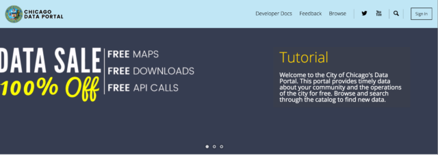
“What’s this sales thing? It makes it look like it’s advertising stuff,” GPBlight (#4) said in response to reviewing the header images. When the homepage first loaded, a bug was immediately noticeable because the header images would stack and cause the page to jump upon load. While that is a detectable fix, we identified a larger opportunity to share information about what the website does. Very few testers reacted to the initial “data sale” image and those who did react had negative responses. The first header image, before rotating to either the crime or Divvy data, should define the purpose to the site while being as clear and direct as possible. The current “data sale” language and images confuse some users.
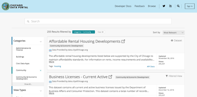
Searching for datasets was not always intuitive when using search or categories and testers often had to try multiple times to complete a task.
We asked testers to search for six different datasets; one was open-ended, while the rest proctors requested that they find specific datasets: building permits, a map of crime data, recently fixed potholes, active business licenses, and Chicago’s community boundaries map. We were interested to see how testers would search and find the datasets and what issues they came across during the process. While 12 testers (70%) indicated that finding these datasets was “easy” or “very easy” we witnessed that it often took testers multiple tries to find the correct dataset and some testers could not find the proper result or chose a relevant, but not requested dataset.
Categories were often chosen over search bar, but technical bugs and design influenced those choices.
Only 1 tester out of 17 (6%) used the search bar consistently for all of the dataset search tasks, whereas 7 testers (41%) used categories to complete all dataset search tasks. The remainder of testers used both search and categories to find what they were looking for depending on the type of dataset we requested them to find.
On mobile devices, the magnifying glass of the search bar was not working properly. Therefore, if testers attempted a search nothing would appear and testers thought the search was broken or that there were no search results.
When doing the initial review of the page, only 1 tester mentioned the search bar, which indicates that it is not a prominent part of the page. When asked about what actions they knew they could do from reviewing their page, only 2 testers mentioned the search bar. When asked to take their first action, 3 testers (18%) searched whereas 10 (59%) clicked on a data catalog category.

We understand that a lot of these testers did not have much experience with the data portal and the data catalog categories are useful for exploration purposes. Nonetheless, we realized that the search bar was not very prominent for testers. Suggested improvements included larger font, higher contrast, and a more prominent location on the page.
Categorization needs to be more intuitive and filtering a higher priority in the user experience or search needs to be more flexible.
While testers knew where to find building permit and crime data, finding recently patched potholes, active business licenses, and community boundaries was more challenging. In one example, 10 out of 11 testers who found the active business licenses dataset had explored other categories first.
Testers expected to find the potholes data in these categories: Public Safety, Environment, and Sanitation. Testers expected to find active business licenses in Administration and Finance. Lastly, testers looking for community boundaries looked in the Community category.
Some testers did use the help text on the categories to make decisions about which category to choose, but it was difficult to decipher the order of results and whether a category contained the relevant dataset after choosing a category. Testers did not use the filters on the search results page, and upon reviewing a few datasets without identifying a relevant one, would often rely on search or finding another category. Providing users with an understanding of an order of the results and then the ability to filter easily to find the most appropriate results would be beneficial to this experience. Improving the filter functionality would make it easier to have datasets in multiple relevant categories and give users ways to find the data more quickly.
We also witnessed that testers did not always distinguish between the type of data– whether it was a dataset, data lens, filtered view, or map they were choosing. This was evident when we asked testers to find a map of crime data and testers chose the dataset or filtered view results that were higher on the results list.
A primary search method should be defined for the user. Currently, users can choose a category or search, but both have their challenges. Outlined above are results and improvements for the categories since that was a prominent way testers searched. For each task, 11 or more testers used the categories in completing their search. If the search box was more prominent on the page and functioned better on mobile, we could identify if search was a better way for testers to complete these tasks. We did learn that testers had difficulties with the search terms that they used and spelling errors caused stopping points in the experience. The bug on mobile also caused a stopping point that forced testers to use categories. If search becomes the primary method of finding datasets it should be flexible to account for spelling errors and find relevant resources.
Testers liked the “Digital Chicago” & “How to Videos” resources on the homepage, but the “Chicago apps” were seen as being the most relevant.
Testers reviewed the other sections of the homepage including the “Digital Chicago” section that showcases recent articles by the City of Chicago’s Department of Innovation and Technology, “How to Videos” that showcase how to use the data portal and other tools, and “Chicago apps” tools that use open data that let people better visualize data (OpenGrid) or is related to city services (311 service tracker).
48% of testers thought the “Digital Chicago” section was “relevant” or “very relevant,” but testers felt that “Digital Chicago” did not mean much to them (calling this section “news” could be an improvement), they had questions about the articles and what they meant, and this section lacked descriptive content for residents.
66% of testers thought the “How to Videos” section was “valuable” or “very valuable” and a lot of testers liked receiving information via video, although there was a consensus that they should be shortened and users should know that they will be directed to YouTube.
76.5% of testers were likely to use the apps under the “Chicago apps” section because they saw them as useful to have for residents. 15 of our 17 (88%) testers were not familiar with these apps prior to visiting the website. The “Chicago apps” section met expectations from testers who at the beginning searched for or were interested in city services. There was a positive reaction to these tools and increased the likelihood of using the Open Data Portal in the future.
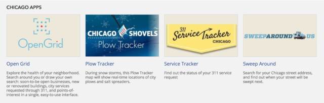
For the resident user, we would suggest placing the “Chicago apps” section higher on the page because it relates to their needs. To avoid the confusion in distinguishing between the Open Data Portal and the City of Chicago website, adding a descriptive sentence about what “Chicago apps” is and why it’s on this page would be valuable. Sharing that these tools are using open data would describe the importance of the open data initiative while giving residents tools that they could use in their daily lives.
Screenshot of misaligned layout on mobile devices
Next steps
Based on this CUTGroup test, work is already in progress to make changes that respond directly to our CUTGroup testers’ feedback. DoIT and Socrata are considering changing the Open Data portal’s layout to include:
- Featuring the “Chicago apps” section higher on the homepage
- Changing the design of the search box to be more prominent
- Distinguishing between sections to make each section more apparent and separate from the next
- Improving layout to be work better on mobile devices
DoIT is also thinking about creating shorter, more digestible tutorial videos for the “How to Videos” section. Finally, the banner will be reviewed and redesigned to be more user-friendly on all devices.
We look forward to future iterations of the Open Data Portal, and seeing how resident feedback was included in that process.
Final Report
Here is a final report of the results:
Here is the raw test data: