The Smart Chicago Collaborative is proud to launch our latest version of the Chicago Health Atlas. Last fall, Smart Chicago conducted user testing on the Chicago Health Atlas. Out of those results, there were several points made on what we could improve. The main one being that it was difficult to find health resources on the site. We’ve taken the feedback from the test and used it as a basis to improve the new site. Here’s a rundown of the new features:
Better focus on finding resources
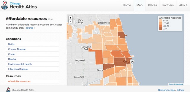
One of the biggest takeaways from feedback gained from the civic user testing, was that it was difficult to find where to get resources. Now, when you go to the homepage, the resource page is easier to find and in red coloring to differentiate it from the other categories.
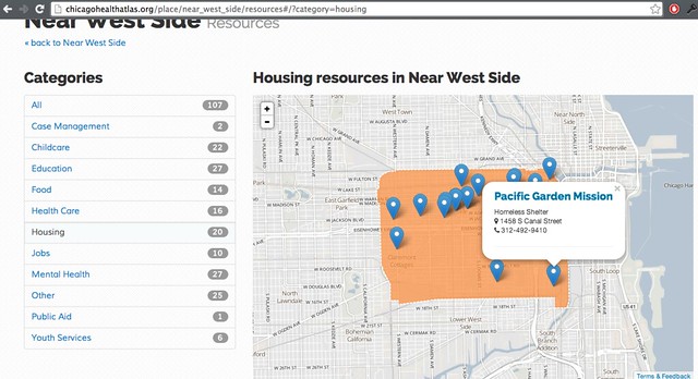
When you click into a specific neighborhood, it further breaks down resources by type (childcare, food, healthcare, mental health and more). Clicking on the category will show you locations on the map as well as a list at the bottom with contact information from each resource.
The data for the health resources comes from our partnership with civic startup Purple Binder. Purple Binder works with healthcare systems, local government, and non-profits in order to collect information on social services. We worked with Purple Binder to develop an API for their data, which is now used to fuel the Chicago Health Atlas.
Uninsured
The Chicago Health Atlas is also now pulling information from the American Community Survey to show where the uninsured live. (Granted, there’s no detailed information yet on how the Affordable Care Act has impacted these numbers.)
Health Care Provider Information
The site also provides information about health care providers in each neighborhood. This information was gathered by our partner Rob Paral and Associates. The data shows the number of healthcare providers by profession per 1,000 residents and compares it to the city average.
Additional Demographics
The site also uses census data to show additional demographic data including poverty level, crowded housing, and unemployment. This data also comes from the American Community Survey and like all the data on the Chicago Health Atlas, the site directly links to the source.
Next Steps
When conducting the first test, we noticed that several testers who did not have health insurance coverage were looking to see where they could get health care. Originally, this was not one of the use cases that the Health Atlas was designed to cover. Now that healthcare.gov gets fully implemented, we plan on doing another test to see if people are still using the Chicago Health Atlas for this purpose.
In addition, we’ll also test to see if the new resource pages make it easier for people to find health care resources in their neighborhoods.
To find out more about how you can get involved about civic user testing, visit the CUTgroup site here. To learn more about the Chicago Health Atlas, visit the Chicago Health Atlas website.
A special thanks goes out to our funder, Otho S.A. Sprague Memorial Institute, which is a great leader in the vision for this site. We also appreciate the great work of our main technology contractor, Derek Eder of Data Made, and the insights of our endless partners at the Chicago Department of Public Health.


