 For our thirtieth Civic User Testing Group (CUTGroup) session, we tested the current Chicago Park District website. The main goal of this test was to understand the user experience in preparation of an upcoming re-platforming and redesign of their website. We wanted to understand how users currently navigate this website when completing tasks, specifically searching for information. We wanted to understand how users search for information and what improvements would make search and navigation easier.
Segmenting
We were interested in testing specifically with Chicago residents who had different experiences with the Chicago Park Districts and its website. Therefore, we asked our CUTGroup testers if they visited the Chicago Park District website before, and if so, for what reasons. We were also interested in how frequent they visited parks over different seasons and the activities they enjoyed doing at the parks. We were also looking to have half of our testers test on their mobile devices, while the other half would test on laptops.
Screening Questions
During our initial call-out for testers, we heard from 70 CUTGroup members. Out of these respondents, we heard that 61 respondents (87%) used the Chicago Park District website in the past. 44 of these 61 respondents (72%) used it to find an activity, 41 (67%) used the website to find event information, 38 (62%) used it to find a park or facility, 31 (51%) used it to find a program, 12 (20%) used it to find employment, and 9 (15%) used it to apply for a permit or rental.
Out of the 70 respondents to our screening questions, 37 (53%) visit a Chicago park at least once a week during the Spring and Summer months, and 16 (23%) visit a park at least once a week during the Fall and Winter months.
We were looking to test with between 20 and 25 testers, and 21 testers participated. 7 testers tested on laptops, 6 on Android mobile devices, 8 on iOS mobile devices
Test Format
We conducted an in-person, moderated usability test where each tester was paired up with a CUTGroup proctor or a Chicago Park District staff member. Proctors helped guide testers to complete tasks on the website, observed how the tester navigated and used the site, and took notes on their experiences and ideas for improvements. One-on-one proctoring like this allows us to work closely with a tester to see if the website functions in an expected way.
Results
Contributions to this test were made by our CUTGroup proctors. Erik Hernandez, Peter McDaniel, and Nancy Simon all assisted with moderating the test. CUTGroup proctor, Nathalie Rayter, wrote the analysis report for this test. The CUTGroup Proctor Program trains once highly active CUTGroup testers to learn more about usability (UX) testing and CUTGroup test processes.
On February 8, 21 CUTGroup testers tested Chicago Park District website at the Near North library.
This presentation was shared with the Chicago Park District team and highlighted some of the top results from the test.
Many testers had trouble indicating whether it was easy or difficult to search for information.
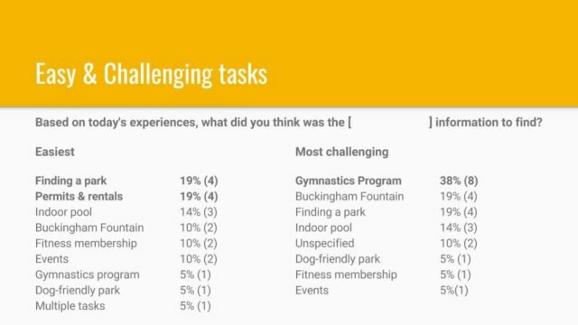
In total, testers were asked to complete 8 unique tasks in this CUTGroup test. There were some tasks that were easier to complete than others:
At the end of this CUTGroup test, we asked testers how easy or difficult it is to use the website overall; a plurality of 9 testers (43%) said it was “neutral,” either weighing the easy and the difficult tasks equally or identifying particular pain points that hindered their experiences. One of these pain points was the functionality of the website’s search functions. There are several possible changes that could be implemented into a redesigned site that would increase the ease of searching for specific information.
Broaden allowable key terms in the search box.
Throughout the CUTGroup test, testers experienced varying degrees of success in using the search box to complete their tasks. Testers liked the availability of suggested search terms, but there were multiple instances during test tasks when the first choice of the user would be to enter a key term and a ZIP code into the search box. These searches sometimes led to relevant information, but often did not — for instance, when tester Mia (#1) searched “dog park 60610,” but the returned results were confusing, and she could not identify the dog park nearest to her home.
Although ZIP code search is built into the “Find a Park” and “Find a Facility” functions, it is likely that Chicago Park District site visitor will continue to search using ZIP codes in the search box. A possible solution to increase the effectiveness of these search queries would be to prompt users who enter in geographic data like ZIP codes to instead access one of the aforementioned search tools. For instance, the results of a search of “dog park 60610” might be accompanied by a simple linked statement: “I see you’re searching for something near 60610. Have you tried searching by Park or Facility?” Directing users to take advantage of these more customizable search tools could reduce search times and help them find accurate information more quickly.
Increase the visibility of search filters.
Difficulty using search filters was one of the recurring challenges that testers encountered during park and facility search tasks. Notably, after completing the indoor pool task, 3 testers expressed a desire for filtering by descriptors like “indoor” and “zero depth entry”; they didn’t see that those filters are already present on the “Find a Facility” page. Search filters like these are currently present, nested underneath dropdown categories like “By Descriptor” or “By Facility,” which are closed by default. Additionally, these filter menus appear underneath the search headings, but they are not described as “filters.”
Site users might experience greater ease in searching if the visibility of these existing filters were increased. One possible solution is to cue users to filter their searches by adding prominent, familiar language like “Filter search results” or “Advanced Search” to the initial search page. Another way to guide users might be to add the prefix “Filter by” to the categories. For example, use “Filter by Descriptor” instead of just “By Descriptor.”
Testers also recommended adding a more prominent search button, like an arrow or a “GO” button, adjacent to these filters so that users wouldn’t have to scroll down to submit filtered search queries.
Testers thought that information and search results could be more relevant to them with more options to search by location or audience.
Throughout the tasks of this CUTGroup test, testers encountered some difficulty in parsing what information was relevant to their tasks, whether based on location or audiences served. Here are some changes that could be made to improve the relevance of users’ searches.
Allow users to search for parks and facilities by address.
In the location search tasks, several testers experienced confusion over which of the returned search results were nearest to their intended locations even after they used a location filter to narrow their searches; this is likely due to the large footprints that many ZIP codes and community areas have. For example, during the park search, Twiller39 (#7) assumed that the first result from their search by community area would be the closest to the test location library simply because it was first.
Although ZIP code and neighborhood search exist, the results don’t sort based on proximity to a point within that ZIP code. Moreover, users don’t always know what their neighborhoods’ official boundaries are.
The most straightforward solution to this challenge would be to add a “Search by Address” function. Users would able to enter a fixed address into the search as a selector, and the search would return results that would be sorted by distance from that point. This would help alleviate some of the confusion over which parks or facilities were nearest to the desired location.
Another possible solution would be adding a location access request from the Chicago Park District website to the user. If a site visitor gave permission for the website to access their specific location, query results could be sorted by distance from that point by default; additionally, the map view of results could display a beacon to indicate where the visitor was access the website from. Clarifications like these could help visitors quickly obtain more relevant search results.
Eliminate or preempt search radius from denying search results.
There were several instances throughout the CUTGroup test when testers were unable to find meaningful results because of the radius of their ZIP code search. For example, while looking for the indoor pool nearest to his home, the initial combination of Regular Guy’s (#21) ZIP code and the “indoor pool” descriptors yield any results. During the task of finding a dog-friendly park nearest to their homes, 7 testers found that filtering results by their ZIP code or Community Area yielded no results because there were no dog-friendly parks in their areas, and they had to expand their search areas.
This process can be eased and even shortened by making changes to the way that ZIP code search works. One possible solution is to prompt users to expand the radius of their search. A ZIP code search with too small of a radius (the default is 1 mile) results in a page that says, “Your Zip Code search for “606__” returned 0 results.” The returned text could go on to recommend that users try expanding the radius.
Another solution is to eliminate the search radius entirely; in this scenario, when a user enters their ZIP code to search for a facility, the returned search results could include an estimated distance from the searched ZIP code and the ability to sort the results by distance.
Make Map view of search results more prominent
Across the three tasks in which it was tracked (Park nearest to the library, indoor pools, and dog-friendly park), 73% of testers’ searches were primarily conducted using list view; only 8% of searches used the website’s map view. However, particularly in the search for nearby parks, testers had difficulty identifying which of the listed search results were nearest, and tester Eddy (#13) even said that he needed a satellite view, apparently not realizing there was a map view option.
This navigational confusion could be eased if map view results were made more apparent. On the current website, the toggle between “List view” and “Map” is small and inconspicuous, above the search results and filter and below the heading. This text could be enlarged and emphasized to call users’ attention to the map option.
Another possible solution would be to guide users to the map by showing it to them right away. The default of displayed search results could be a list accompanied by a small map to the side, with the option to toggle to or expand the map.
Send or display customized information to users based on location and demographics.
When asked about the value a redesigned Chicago Park District website could have to them, 2 testers said it would be valuable to be able to get customized information about the most nearby and relevant parks.
This could be addressed by allowing users to assign a park or community area as their homebase. New users to the park could be prompted to “Choose My Park” when they access the Chicago Park District website for the first time, and this could indicate some of the links that would be displayed on the homepage, as well as featured search results. This information could then be retained for future visits.
Another possible solution is the creation of customized alerts. Right now, the current CPD email newsletter sign-up offers only a few choices for content customization. A future form might allow users to select several parks and/or audiences (such as families, teens, or adults) they are interested in receiving info about; users would then receive regular digests of updates pertinent to those selectors (perhaps automated by RSS aggregation).
Accessing the Chicago Park District website on mobile devices posed additional challenges to testers using their smartphones.
14 testers (66%) completed the CUTGroup test on a smartphone or tablet, and throughout the tasks, many of them encountered some challenges in using the Chicago Park District’s mobile website.
Improve mobile UX by ensuring responsiveness.
Some testers commented on the way the webpages of the Chicago Park District site displayed on their devices. Tester Hockey312 (#9) noticed that the mobile pages had to be resized throughout their navigation experience, including the Chicago Park District ActiveNet portal. Treasure (#2) was unable to locate an indoor pool near her home using her phone because the displayed information was “super small” and she had trouble zooming in to view it. Lauren1 (#19) said the menu bar took up a lot of space at the top of the mobile homepage.
The mobile user experience of the Chicago Park District website can be improved through ensuring that a redesigned website is fully mobile-friendly. One solution is to ensure that each web page is responsive to the device and browser it is displayed within; ideally, pages would not have to be resized by the user in order for them to make out the displayed text.
The mobile experience could also be improved by increasing the size of displayed text and reducing the page real estate currently occupied by banner images and menu bars.
Make Map view more mobile-friendly.
Several testers described difficulty in using Map View on their mobile devices. When searching for a dog-friendly park near their home, Angel (#8) found that it was difficult using the Map view of results on their smartphone because it was challenging to zoom in and out of the map display. Currently, when a user toggles to Map view in a mobile browser, the map does not immediately appear, and the user must scroll down in order to view the map interface. They must then use two-finger scroll to move across the map.
This experience could be improved by displaying the map immediately when a user selects Map view, either taking them to a new page or by automatically scrolling down to where the map appears.
Final Report
Here is a final report of the results:
Here is the raw test data: