Digital Inclusion Meets Open Leadership: Connect Chicago & the Mozilla Global Sprint

This year I’ve had the opportunity to participate in the third cohort of Mozilla Open Leadership Training. During the 14-week program I learned from mentors and fellow project leads across the world working on collaborative initiatives promoting an open, healthy Internet for all.

In the program’s own words:

Open Leadership Training is for anyone who is currently running or starting an open project and wants to invest in their open leadership skills. Project leads, partners, or small groups of co-leaders responsible for project success and growth.

The project doesn’t have to be technical! It can be curriculum (open educational resource), an open data project or report, an open source software project, or anything else that has: 1. a way for others to get involved 2. a feature, release, or MVP (minimum viable product) to work on publicly with community members for the duration of the program

At Smart Chicago we do a lot of work within the broader category of tech inclusion — whether it’s about onboarding nonprofits into the data ecosystem, getting residents involved with improving civic tech tools, or building smart city infrastructure with resident input. Though much of our project work (especially on the civic tech and data side) already exist in the open, I was interested in bringing the spirit of open work to our biggest digital inclusion initiative: Connect Chicago.

Applying Open Leadership Practices to Local Digital Inclusion Work

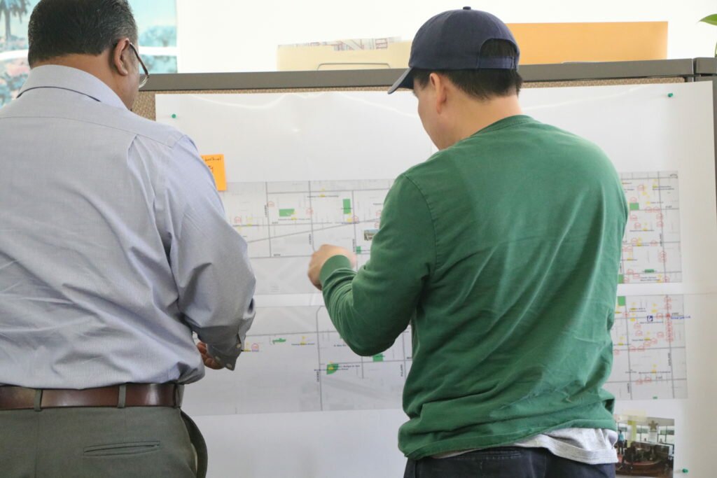
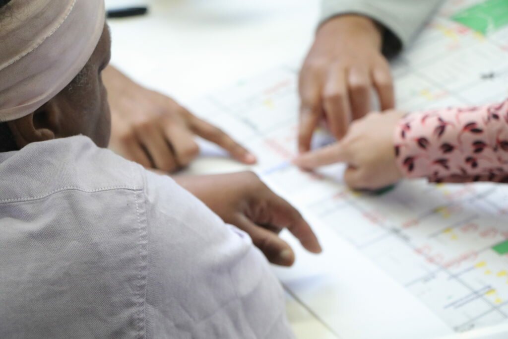
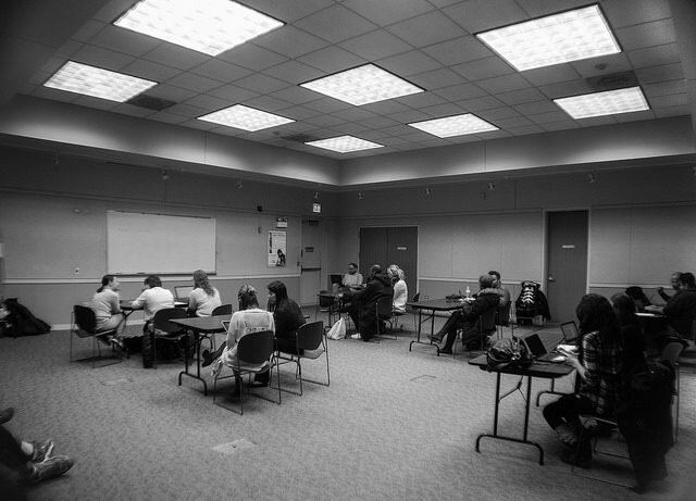
Connect Chicago is a citywide digital inclusion initiative focused on increasing access to the Internet and digital learning opportunities. Throughout 2016 and 2017 we’ve worked to bolster in-person collaboration through Connect Chicago Meetups and recent neighborhood-based participatory design sessions with DePaul University. Given that goal and our desire to strengthen online collaboration methods for current and future contributors, applying Open Leadership Training to the work made sense.

At Smart Chicago I get to work at the intersection of digital inclusion, civic tech, and open data. One thing I love about working at that intersection is that I get to think about how each of those sometimes siloed categories of public-serving technology can inform the others. In the past I’ve talked more broadly about how the digital inclusion and civic tech communities could collaborate better. My natural frame of mind within that conversation was previously skewed in one direction; I mostly focused on what digital inclusion partnerships could do to strengthen civic engagement in civic tech.

Now, in addition to thinking about how digital inclusion can strengthen civic tech, I’m considering how civic tech processes can be adapted to improve local and national digital inclusion work. Civic tech communities are quick to share, quick to remix others’ work, considering user experiences, and are generally good at harnessing the power of volunteerism. Though digital inclusion work like Connect Chicago is less technical than a civic tech project, the “build with” attitude matters just as much.

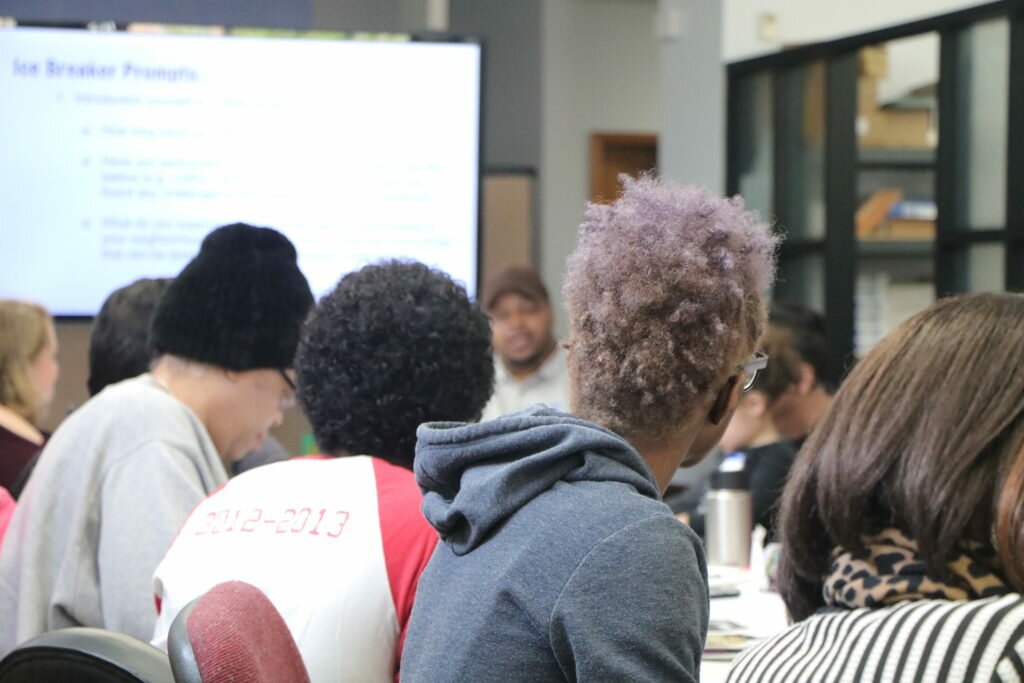
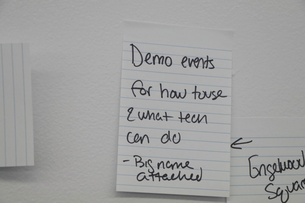
In that spirit, Connect Chicago has strategized how to open up our work more to invite more collaborators and more feedback. Meetups provide a platform for digital inclusion advocates and practitioners to share ideas, best practices, and resources. Community Technology Forums are an emerging channel for residents to co-design digital inclusion priorities. Community members and national peers can drop into our Google Folder to see our materials and even edit documents or notes. We also created a centralized onboarding form to point potential collaborators to the modes of participation they are most comfortable with (ex: Google, Meetups, Slack). Bringing this work the the Mozilla Open Leadership Cohort and the 2017 Global Sprint was the next step in that journey.

Join the Mozilla Global Sprint

Connect Chicago is pleased to participate as a Mozilla Global Sprint 2017 project this Thursday and Friday June 1st & 2nd. The Global Sprint is like a giant global hackathon/ideathon that anyone with a device and an internet connection can participate in. Given that increasing quality online and offline collaboration is a current priority, we embrace this experience as a Mozilla Global Sprint Project to invite current and new collaborators into Connect Chicago work.

It’s easy to get involved remotely. As a first step, I recommend that you read the Connect Chicago Project Roadmap — a one stop, centralized starting point for how to contribute to Connect Chicago’s digital inclusion work during the Mozilla Global Sprint and beyond.

Note that beyond a general comfort with Google docs, there are no other prerequisites to being a meaningful contributor to Connect Chicago. Even if you’re just inserting or submitting comments/questions into our shared collaboration doc, all input is welcome. You can also engage on Twitter! Tweet ideas, questions, and updates using #mozsprint #ConnectChicago.

If you’re a local Chicago resident and want to participate in the Global Sprint in person, there’s an option for you! On Friday, June 2nd I will be online and in Chicago with my fellow local Open Leadership Cohort members, David Bild of the Peggy Notebaert Nature Museum and Priya Shah from the City of Chicago’s Department of Innovation and Technology. To join to the local Chicago Sprint, register here while space is available!

Want to read more about this work and how Connect Chicago is involved? The Mozilla Global Sprint team just interviewed me on their blog! You can read the full post here. You can read other project leads’ interviews here.

Future Open Project Work Advancing Digital Inclusion

Thus far, open working practices (both online and in person) have improved Connect Chicago and we hope get even better over time. Open working has been a great way way to crowdsource information about digital inclusion resources, gather expertise from many valued local collaborators, check our assumptions, and increase momentum around our mission.

I’d love to collaborate with others locally and nationally to think more about how to challenge the “how” of digital inclusion work in this way. Anything the Connect Chicago community creates is fair game for others to use, remix, adapt to their city, and share. Open working has major implications for not only local projects like Connect Chicago, but also national networks of digital inclusion practitioners working across municipalities and tackling similar problems. We could apply open working strategies to co-build new projects, share and build on each other’s digital inclusion data work, or create truly open and editable training materials, just to name a few possibilities.

If others are interested in talking more about open digital inclusion work, feel free to email me at .

Announcing the June Connect Chicago Meetup: Empowering Girls Through Technology

At the next Connect Chicago Meetup, we’ll have a roundtable discussion led by a panel of trainers and nonprofit representatives that work every day to leverage tech training to improve the lives of girls and young women across Chicago.

Special guests that will share their work and help us discuss this topic:

• David Lane, YWCA Chicago

• Asia Roberson, Digital Youth Divas

Here’s the event information:

Event: Roundtable Discussion: Empowering Girls Through Technology

Where: The Literacenter — 641 West Lake St. (read more about Literacenter here)

When: Friday, June 9th from 11am to 1pm

RSVP here.

Come join the conversation and help fuel an equitable tech ecosystem in Chicago. Meet and network with computer trainers, nonprofit professionals, technologists, community advocates, and fellow residents who care about digital inclusion in Chicago. Please RSVP on Meetup so we can get an accurate count for lunch. Thank you!

The Connect Chicago Meetup is a monthly gathering of computer trainers, nonprofit professionals, and fellow residents who care about the digital lives of Chicagoans. In 2017, Meetups will be held downtown and some events (called Community Technology Forums) will be held at community learning & nonprofit sites across the city. Email me at [email protected] with any questions, concerns or ideas for future Connect Chicago Meetups.


Designing Meaningful Civic Interactions with Data

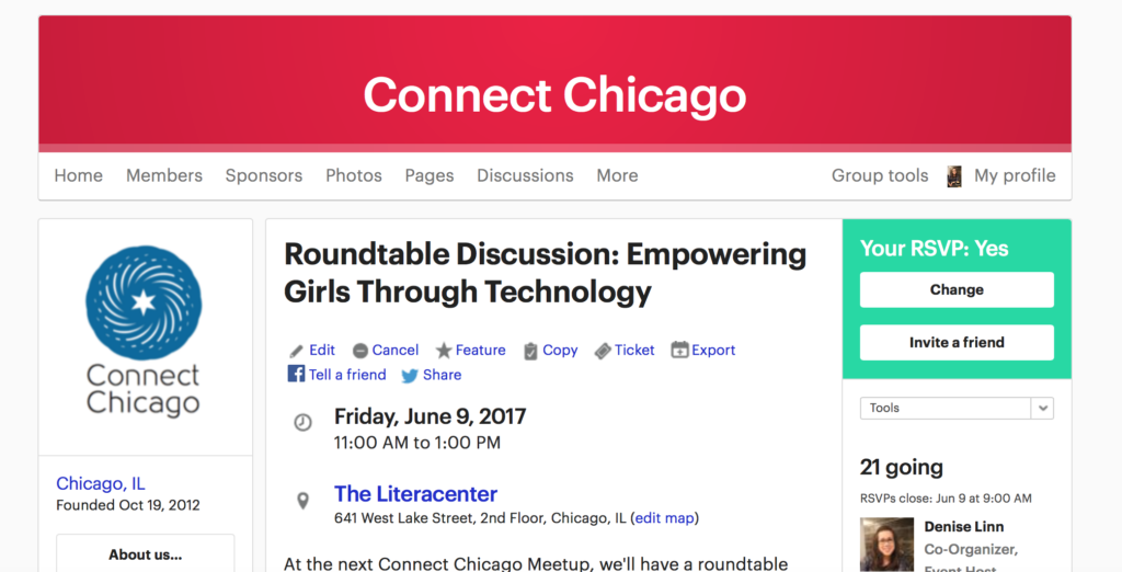
This blog post is by Mark Díaz, the Smart Chicago Collaborative’s graduate fellow from Northwestern University’s Technology & Social Behavior PhD program. Mark is assisting with Smart Chicago’s collaborative data work, supporting efforts in data-driven journalism and advocacy.

Many tools aim to synthesize large amounts of data into engaging and digestible forms. Flashy infographics and interactive data tools can be found in advertisements, in news, and in educational settings. They bring to life static visualizations by letting users manipulate what they see— from zoomable geographic maps showing detailed landscapes and terrain to bubble charts summarizing data breaches, users can discover more information and rich stories  in a single, interactive data tool.

Introducing interactive elements to a data tool, however, risks potential information overload. With more data to digest, highlighting the most important components and allowing the user to step through information at a comfortable pace becomes a challenge. Because interactive visualizations can take many forms, there is no single way to design an elegant user experience. One way to counteract information overload is to construct a narrative within an interactive data tool. These engaging tools are designed for specific users and designed for those users to leave with specific takeaways in mind.

Given my background in design and my emerging interest in civic tech and data engagement, I wanted to highlight a crop of tools that I think offer engaging experiences driven by both interactivity and narrative flow.

Tools that check our assumptions

The New York Times regularly puts out interesting charts and infographics on a variety of topics. In particular, their You Draw It series features interactive graphs depicting various trends, including the effect of Obama’s domestic policies and the relationship between family income and children’s college prospects.

What sets these interactive data tools apart from others is the fact that the user has to complete unfinished graphs with their own guess before they can see the real data. The tools do a great job of forcing the user to take a few seconds to think about their perception of the world and, in doing so, check their understanding. The graphs then present the real data in comparison with user’s guesses.

Some of the You Draw It graphs will even tell you how your guesses compared to other people’s guesses. It might be tempting to give the facts of an often misunderstood story upfront, but hooking users by leveraging their own perspective can help them think carefully about the data they are seeing.

Tools that address the “so what?”

A lot of data tools and visualizations out there are interesting and fun because of unexpected or funny data. Maps showing regional slang terms or the richest person in each state can offer some fun surprises, but, not all data will seem equally personal or relevant to all people. More importantly, sometimes it can be difficult to connect the data in a visualization to what it means for an individual and their community. The Use of Force Project features extensive information about use of force policies in different police departments along with a 12-page report on the relationship between these policies and police violence. Before getting to the data tool, the site presents the user with a thesis statement and concise bullet points framing why use of force policies deserve attention.

The website has a plethora of information, yet it’s easy to walk away with the main idea and argument. Online, the most valuable currency is attention and a compelling “so what” can hold attention a little longer.

Tools that address the “what now?”

Our States is a nifty site created by StayWoke, a nonprofit dedicated to supporting data, design, and policy-related projects pursuing equity and justice. The OurStates website leads with a mission of challenging policies endorsed by the Drumpf administration. When first landing on the page, the user is met with why the tool exists and is presented with an expansive interactive map. The map is rich with information about policies both in harmony with and opposed to President Drumpf’s political platform.

The tool foregrounds civic engagement and gives information on specific action that users can take to support or challenge legislation. The tool gives an overview of legislation across the country while simultaneously allowing users to home in on their own state. A downloadable guide sits just below the map and complements newly learned political knowledge with political action. The site makes it straightforward for the curious user to take next steps toward channeling energy into civic response.

The tool foregrounds civic engagement and gives information on specific action that users can take to support or challenge legislation. The tool gives an overview of legislation across the country while simultaneously allowing users to home in on their own state. A downloadable guide sits just below the map and complements newly learned political knowledge with political action. The site makes it straightforward for the curious user to take next steps toward channeling energy into civic response.

Designing with a narrative in mind

Ultimately, each of the data tools above communicates clearly to the user. These aren’t just standalone tools. They are imbued with different perspectives and, just as an essay helps you think through arguments and ideas, so do compelling data tools. Rather than simply display new information to the user, they compel the user to learn, reflect, and sometimes act. When thinking about advocacy and civic engagement, strategic design starts with a few simple questions: Who do I want to use this? Why do I want them to use this? What do I want to happen when they use this? What do I want to happen after they use this? Great data tools will, in one way or another, supply users with the answers to these questions. Data tools offer an informal space for civically engaging users and helping them become better social critics.


CUTGroup #30 – Chicago Park District

Full room at CUTGroup test #30 of the Chicago Park District website
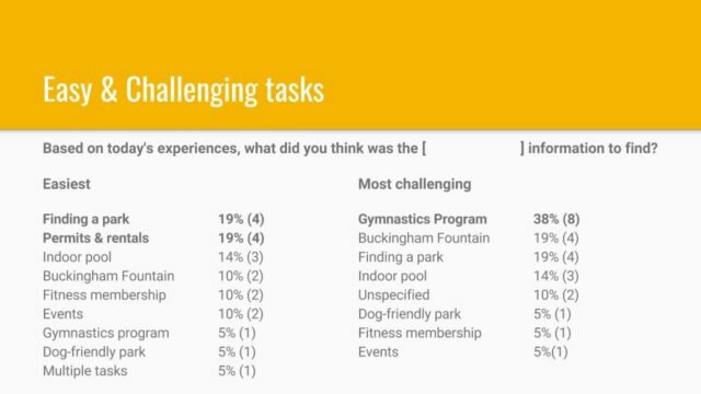
For our thirtieth Civic User Testing Group (CUTGroup) session, we tested the current Chicago Park District website. The main goal of this test was to understand the user experience in preparation of an upcoming re-platforming and redesign of their website. We wanted to understand how users currently navigate this website when completing tasks, specifically searching for information. We wanted to understand how users search for information and what improvements would make search and navigation easier.

Segmenting

We were interested in testing specifically with Chicago residents who had different experiences with the Chicago Park Districts and its website. Therefore, we asked our CUTGroup testers if they visited the Chicago Park District website before, and if so, for what reasons.  We were also interested in how frequent they visited parks over different seasons and the activities they enjoyed doing at the parks. We were also looking to have half of our testers test on their mobile devices, while the other half would test on laptops.

Screening Questions

During our initial call-out for testers, we heard from 70 CUTGroup members. Out of these respondents, we heard that 61 respondents (87%) used the Chicago Park District website in the past. 44 of these 61 respondents (72%) used it to find an activity, 41 (67%) used the website to find event information, 38 (62%) used it to find a park or facility, 31 (51%) used it to find a program, 12 (20%) used it to find employment, and 9 (15%) used it to apply for a permit or rental.

Out of the 70 respondents to our screening questions, 37 (53%) visit a Chicago park at least once a week during the Spring and Summer months, and 16 (23%) visit a park at least once a week during the Fall and Winter months.

We were looking to test with between 20 and 25 testers, and 21 testers participated. 7 testers tested on laptops, 6 on Android mobile devices, 8 on iOS mobile devices

Test Format

We conducted an in-person, moderated usability test where each tester was paired up with a CUTGroup proctor or a Chicago Park District staff member. Proctors helped guide testers to complete tasks on the website, observed how the tester navigated and used the site, and took notes on their experiences and ideas for improvements. One-on-one proctoring like this allows us to work closely with a tester to see if the website functions in an expected way.

Results

Contributions to this test were made by our CUTGroup proctors. Erik Hernandez, Peter McDaniel, and Nancy Simon all assisted with moderating the test. CUTGroup proctor, Nathalie Rayter, wrote the analysis report for this test. The CUTGroup Proctor Program trains once highly active CUTGroup testers to learn more about usability (UX) testing and CUTGroup test processes.

On February 8, 21 CUTGroup testers tested Chicago Park District website at the Near North library.

This presentation was shared with the Chicago Park District team and highlighted some of the top results from the test. 

Many testers had trouble indicating whether it was easy or difficult to search for information.

In total, testers were asked to complete 8 unique tasks in this CUTGroup test. There were some tasks that were easier to complete than others:

Easy & Challenging tasks


At the end of this CUTGroup test, we asked testers how easy or difficult it is to use the website overall; a plurality of 9 testers (43%) said it was “neutral,” either weighing the easy and the difficult tasks equally or identifying particular pain points that hindered their experiences. One of these pain points was the functionality of the website’s search functions. There are several possible changes that could be implemented into a redesigned site that would increase the ease of searching for specific information.

Broaden allowable key terms in the search box.

Throughout the CUTGroup test, testers experienced varying degrees of success in using the search box to complete their tasks. Testers liked the availability of suggested search terms, but there were multiple instances during test tasks when the first choice of the user would be to enter a key term and a ZIP code into the search box. These searches sometimes led to relevant information, but often did not — for instance, when tester Mia (#1) searched “dog park 60610,” but the returned results were confusing, and she could not identify the dog park nearest to her home.

Although ZIP code search is built into the “Find a Park” and “Find a Facility” functions, it is likely that Chicago Park District site visitor will continue to search using ZIP codes in the search box. A possible solution to increase the effectiveness of these search queries would be to prompt users who enter in geographic data like ZIP codes to instead access one of the aforementioned search tools. For instance, the results of a search of “dog park 60610” might be accompanied by a simple linked statement: “I see you’re searching for something near 60610. Have you tried searching by Park or Facility?” Directing users to take advantage of these more customizable search tools could reduce search times and help them find accurate information more quickly.

Increase the visibility of search filters.

Difficulty using search filters was one of the recurring challenges that testers encountered during park and facility search tasks. Notably, after completing the indoor pool task, 3 testers expressed a desire for filtering by descriptors like “indoor” and “zero depth entry”; they didn’t see that those filters are already present on the “Find a Facility” page. Search filters like these are currently present, nested underneath dropdown categories like “By Descriptor” or “By Facility,” which are closed by default. Additionally, these filter menus appear underneath the search headings, but they are not described as “filters.”  

Site users might experience greater ease in searching if the visibility of these existing filters were increased. One possible solution is to cue users to filter their searches by adding prominent, familiar language like “Filter search results” or “Advanced Search” to the initial search page. Another way to guide users might be to add the prefix “Filter by” to the categories. For example, use “Filter by Descriptor” instead of just “By Descriptor.”

Testers also recommended adding a more prominent search button, like an arrow or a “GO” button, adjacent to these filters so that users wouldn’t have to scroll down to submit filtered search queries.

Testers thought that information and search results could be more relevant to them with more options to search by location or audience.

Throughout the tasks of this CUTGroup test, testers encountered some difficulty in parsing what information was relevant to their tasks, whether based on location or audiences served. Here are some changes that could be made to improve the relevance of users’ searches.

Allow users to search for parks and facilities by address.

In the location search tasks, several testers experienced confusion over which of the returned search results were nearest to their intended locations even after they used a location filter to narrow their searches; this is likely due to the large footprints that many ZIP codes and community areas have. For example, during the park search, Twiller39 (#7) assumed that the first result from their search by community area would be the closest to the test location library simply because it was first.

Although ZIP code and neighborhood search exist, the results don’t sort based on proximity to a point within that ZIP code. Moreover, users don’t always know what their neighborhoods’ official boundaries are.

The most straightforward solution to this challenge would be to add a “Search by Address” function. Users would able to enter a fixed address into the search as a selector, and the search would return results that would be sorted by distance from that point. This would help alleviate some of the confusion over which parks or facilities were nearest to the desired location.

Another possible solution would be adding a location access request from the Chicago Park District website to the user. If a site visitor gave permission for the website to access their specific location, query results could be sorted by distance from that point by default; additionally, the map view of results could display a beacon to indicate where the visitor was access the website from. Clarifications like these could help visitors quickly obtain more relevant search results.

Eliminate or preempt search radius from denying search results.

There were several instances throughout the CUTGroup test when testers were unable to find meaningful results because of the radius of their ZIP code search. For example, while looking for the indoor pool nearest to his home, the initial combination of Regular Guy’s (#21) ZIP code and the “indoor pool” descriptors yield any results. During the task of finding a dog-friendly park nearest to their homes, 7 testers found that filtering results by their ZIP code or Community Area yielded no results because there were no dog-friendly parks in their areas, and they had to expand their search areas.

This process can be eased and even shortened by making changes to the way that ZIP code search works. One possible solution is to prompt users to expand the radius of their search. A ZIP code search with too small of a radius (the default is 1 mile) results in a page that says, “Your Zip Code search for “606__” returned 0 results.” The returned text could go on to recommend that users try expanding the radius.

Another solution is to eliminate the search radius entirely; in this scenario, when a user enters their ZIP code to search for a facility, the returned search results could include an estimated distance from the searched ZIP code and the ability to sort the results by distance.

Make Map view of search results more prominent

Across the three tasks in which it was tracked (Park nearest to the library, indoor pools, and dog-friendly park), 73% of testers’ searches were primarily conducted using list view; only 8% of searches used the website’s map view. However, particularly in the search for nearby parks, testers had difficulty identifying which of the listed search results were nearest, and tester Eddy (#13) even said that he needed a satellite view, apparently not realizing there was a map view option.

This navigational confusion could be eased if map view results were made more apparent. On the current website, the toggle between “List view” and “Map” is small and inconspicuous, above the search results and filter and below the heading. This text could be enlarged and emphasized to call users’ attention to the map option.

Another possible solution would be to guide users to the map by showing it to them right away. The default of displayed search results could be a list accompanied by a small map to the side, with the option to toggle to or expand the map.

Send or display customized information to users based on location and demographics.

When asked about the value a redesigned Chicago Park District website could have to them, 2 testers said it would be valuable to be able to get customized information about the most nearby and relevant parks.

This could be addressed by allowing users to assign a park or community area as their homebase. New users to the park could be prompted to “Choose My Park” when they access the Chicago Park District website for the first time, and this could indicate some of the links that would be displayed on the homepage, as well as featured search results. This information could then be retained for future visits.

Another possible solution is the creation of customized alerts. Right now, the current CPD email newsletter sign-up offers only a few choices for content customization. A future form might allow users to select several parks and/or audiences (such as families, teens, or adults) they are interested in receiving info about; users would then receive regular digests of updates pertinent to those selectors (perhaps automated by RSS aggregation).

Accessing the Chicago Park District website on mobile devices posed additional challenges to testers using their smartphones.

14 testers (66%) completed the CUTGroup test on a smartphone or tablet, and throughout the tasks, many of them encountered some challenges in using the Chicago Park District’s mobile website.

Improve mobile UX by ensuring responsiveness.

Some testers commented on the way the webpages of the Chicago Park District site displayed on their devices. Tester Hockey312 (#9) noticed that the mobile pages had to be resized throughout their navigation experience, including the Chicago Park District ActiveNet portal. Treasure (#2) was unable to locate an indoor pool near her home using her phone because the displayed information was “super small” and she had trouble zooming in to view it. Lauren1 (#19) said the menu bar took up a lot of space at the top of the mobile homepage.

The mobile user experience of the Chicago Park District website can be improved through ensuring that a redesigned website is fully mobile-friendly. One solution is to ensure that each web page is responsive to the device and browser it is displayed within; ideally, pages would not have to be resized by the user in order for them to make out the displayed text.

The mobile experience could also be improved by increasing the size of displayed text and reducing the page real estate currently occupied by banner images and menu bars.

Make Map view more mobile-friendly.

Several testers described difficulty in using Map View on their mobile devices. When searching for a dog-friendly park near their home, Angel (#8) found that it was difficult using the Map view of results on their smartphone because it was challenging to zoom in and out of the map display. Currently, when a user toggles to Map view in a mobile browser, the map does not immediately appear, and the user must scroll down in order to view the map interface. They must then use two-finger scroll to move across the map.

This experience could be improved by displaying the map immediately when a user selects Map view, either taking them to a new page or by automatically scrolling down to where the map appears.

Final Report

Here is a final report of the results:

Here is the raw test data:


CUTGroup #30 | Chicago Park District


Documentation from the Community Technology Forum at Greater Southwest Development Corporation

We’ve compiled the public notes and pictures from the April 22nd Community Technology Forum at the Greater Southwest Development Corporation (GSDC). This public-facing documentation will be followed up with a more detailed report from our partners at DePaul University who are presently analyzing and organizing the ideas generated by residents.

Community Technology Forums are participatory design sessions facilitated by Sheena Erete and Jessa Dickinson from the College of Computing and Digital Media at the DePaul University, hosted by leading local technology changemakers like GSDC, supported by Connect Chicago and Smart Chicago, and fueled by resident voices. So many conversations about technology happen in the Loop everyday — we’re pleased to work with so many people and partners to ensure that community-directed conversations about technology are elevated as well.

Pictures from the event are posted on the Smart Chicago Flickr account.

GSDC Community Technology Forum

Here is an agenda from the event:

We’ve compiled some of the documentation from the event in this Google Folder, a subfolder of the larger Connect Chicago Meetup Folder which houses even more resources and material from digital inclusion events. You can see some of the community maps and handouts we used at the Community Technology Forum in that Google Folder.

We also partnered with the City Bureau Documenters Program to capture public-facing notes from the day including broader themes, ideas, and discussion topics. City Bureau strives to “bring journalists and communities together in a collaborative spirit to produce responsible media coverage and encourage civic participation.” Our Documenter, Corli, took the notes below:

I was personally inspired by this work, excited to see how future Community Technology Forums in other neighborhoods will be similar or different. The more I have the privilege of co-organizing and attending sessions like the Community Technology Forum and the Array of Things Civic Engagement Events, the more I realize the value residents can bring to public technology planning processes. Technology and technology resources — whether they are public computer centers, wireless networks, or environmental sensors — can be deployed for residents and with residents’ input.

Read more about Community Technology Forums here.

To get regular digital inclusion updates, events, and news delivered to your inbox, fill out this form: bit.ly/joinconnectchi.

On the Table 2017: Digital Equity in Education

Over the past three years, thousands of Chicago-area residents have participated in mealtime conversations about how to improve our community through The Chicago Community Trust’s On The Table initiative. Since the launch of On the Table, participants have indicated that equity and social inclusion were among the most frequent topics of discussion at the events they attended.

So, this year, organizers suggest that equity be part of these conversations. Because equity is at the heart of our collective work, The Hive Chicago Fund for Connected Learning, The Hive Chicago Learning Network, and the Smart Chicago Collaborative invite you to join us in hosting a “multi-table” event focusing on Digital Equity in Education.

Youth Digital Equity is the social-justice goal of ensuring that all young people have equal access and opportunities to use technology tools, computers and the Internet as well as the knowledge and skills to use them effectively.

Our aim is to bring new and different voices to the table, while making this as easy as possible for you. We are hoping to organize at least five tables at our Digital Equity in Education On the Table event.

Details

When: 5-7 p.m. Tuesday, May 16

Where: Northeastern Center for College Access and Success (CCAS) – 770 North Halsted, Suite 420, Chicago IL 60642. Please find out more information about CCAS here: http://centerforcollegeaccessandsuccess.org/

RSVP at this link.

Host a table!

Interested in hosting a table at this event? We are hoping to organize at least five tables at our Digital Equity in Education On the Table event. If your organization would like to register to recruit and host a table for the event, we welcome you! Hosting a table is easy as 1-2-3.  All you need to do is:

1.) Sign up as a host here: Register to Host

2.) Invite up to nine guests to join your table and let us know who they are. Invite youth.  Invite teachers.  Invite colleagues who aren’t part of Hive or the connected learning community.  Invite friends.

3.) Facilitate your table’s conversation about achieving equity in the digital age.  We’ll take care of the logistics, including the venue, food, and other preparations.

We will provide more detail to table hosts, once you’ve registered. Please let me know if you have any questions.